The short answer
Use soft window light and a spotless product on a simple surface with one colour story, then check the photo's colour against the real thing. That's it. Everything else in this guide is just working out how to do those five things without driving yourself round the bend.
I know it sounds almost too simple. But skincare is a funny category, you know? Nobody can pick the jar up, nobody can sniff it, and so the photo has to do all the work. Get the light soft and the product clean and you're most of the way there.
What makes skincare photos work
Think about how you buy a face cream online. You can't touch it. You can't smell it. You can't feel whether the tub is cheap and creaky or heavy and nice. So you look at the picture and you decide, in about a second, whether this thing feels clean and calm and trustworthy.
That's the job of the photo. It carries texture, cleanliness and calm, all through a flat screen.
Which is why little things matter more here than with, say, a mug or a trainer. A fingerprint on a white lid reads as "dirty" straight away. A smudge on a pastel jar shows up like a stain on a wedding dress. Pastel and white packaging is gorgeous, absolutely, but it's also a magnet for every speck of dust in the room.
Glossy lids are the other headache. They act like tiny mirrors, so you end up with a bright window shape, or your own silhouette, sitting right on top of the product. It's easy to miss until you see the photo at full size, with a little ghost of yourself holding a camera on the lid.
Then there's the bigger picture: the look across your whole range. If the serum bottle is photographed in warm, moody light and the cream is in cold, bright light, the two products look like they belong to different brands. Buyers notice that even when they can't say why. They just get a vague feeling that something is off.
So the aim is a look you can repeat. Keep the light direction the same, and the surface too, and the distance from the camera. Your range should look like a family.
Light and clean edges
Start with the light, because the light is most of the battle. You want one big, soft source. A large window with the sun not pouring straight in is perfect, and thin white fabric over the glass will calm things down if the day is bright.
Put the light to the side, or just behind the side, of the product. Side light shows off the shape of a jar and gives the surface a gentle, creamy roll from bright to shadow. Light from straight behind can make a lovely glow on bottles, but it can also leave the front dark and flat, so you'll want to balance it.
Now the shadow side. Whichever side faces away from the window will go dim, and a dim, heavy shadow makes a clean product look grubby. So pop a white card opposite the window, close to the product, and it bounces soft light back into the dark side. A sheet of white card or foam board is fine. Move it nearer to lift the shadows more, further away to keep a little shape. If you want to go deeper on all this, the lighting guide walks through it step by step.
Before you shoot a single frame, wipe everything. Lids, jar walls, the base, the surface underneath. A soft cloth for glass and plastic, and look at the product from the angle the camera will see. Fingerprints hide until the light hits them, and then they're all you can see. Wipe, look, wipe again. Boring, but it saves you an hour of editing later.
Keep the camera level too. If you tilt it even slightly, a round jar starts to lean, and a tall bottle looks like it's about to fall over. It feels small while you're shooting and it looks sloppy on the page. A tripod helps, or just stack a few books and rest the camera on them. Check the edges of the jar against the edges of your screen; if they're not square, nudge it.
And watch those lid reflections. Move your head, shift the card, nudge the product a touch. Often a tiny turn of the jar kills the glare, and if it doesn't, shift the white card slightly so it isn't mirrored in the glossy part. Look closely at the lid before every shot. It's the one spot that betrays you.
Keeping colour true
Here's something that catches a lot of sellers out: the colour of your packaging will shift depending on what's around it. A warm lamp turns a white lid cream. A bright coloured backdrop throws its own tint onto the jar. A soft coral can drift towards orange, or towards pink, without you noticing until you put the photo next to the real thing.
Skincare is especially touchy because so much of it lives in gentle shades, pastels and creams, where a small shift changes the whole feel.
So, set your white balance properly. Pop a plain white or grey card (or even a clean sheet of white paper) in the scene, take a reference shot, and use it to tell your camera or editing app what "neutral" looks like. Then the rest of the picture falls into line much more reliably. Don't rely on auto if your light is mixed, say window light plus a lamp. Turn the lamp off. Mixed light is a colour-cast factory.
Next, the honest test: hold the real jar up beside your screen, in daylight, and compare. Is the coral the same coral? Is the white lid actually white? It feels a bit daft, standing there with a jar next to a laptop, but it's the single most useful check there is. If the photo and the jar disagree, trust the jar and fix the photo.
Keep your brand colours steady across the range as well. If your pastel pink looks one shade in the cleanser photo and another in the moisturiser photo, the range stops looking like a range. Shoot them in the same session where you can, in the same light, and check each one against its real twin. For more on getting the basics right across the board, the tips guide is a good companion.
Backdrops, props and scenes
The surface under and behind your product sets the mood before anyone reads a word. Skincare tends to love a handful of familiar choices, and they're popular for good reason.
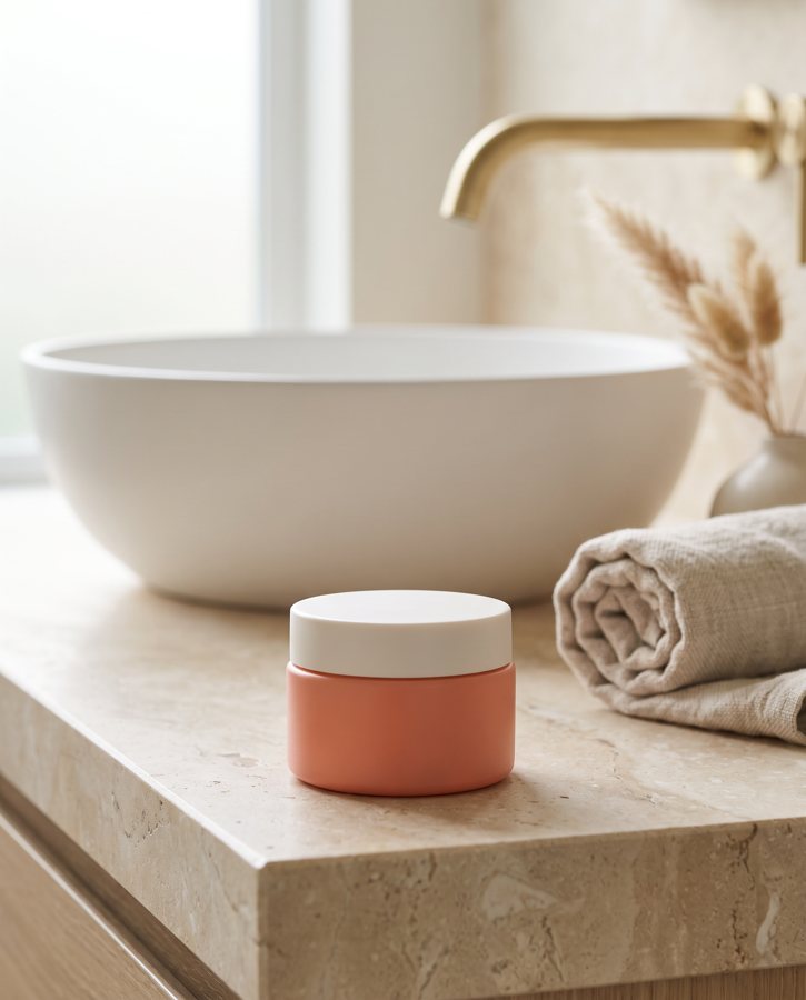
Neutral stone is the safe, calm option. Pale and matte, it lets the jar be the star. Wet stone is a bit more dramatic: the damp surface catches the light and says "fresh" and "water" without any effort. Folded towels bring a spa softness. Ceramic dishes and trays give you tidy shapes to sit a jar on. A few botanical stems, a sprig of something green or a dried grass, add life without shouting.
Then there's the pastel studio set: a plain backdrop, a couple of simple blocks and a plinth to raise the product up. It's playful and clean and it makes round jars look a bit like little sculptures.
Whatever you choose, keep the props few and quiet. One stem. One towel. Maybe a block or two. The moment you pile on pebbles, flowers, a candle and a tiny watering can, the jar gets lost, and the whole thing starts to look like a shop display rather than a product page. If you're wondering whether to add one more thing, the answer is usually no.
And match the mood to your brand. A calm, spa-ish, sensitive-skin brand wants soft stone, towels and muted light. A playful pastel brand can handle bright blocks and bolder colour. Mixing them up feels off: a serious clinical cream sitting among bubblegum blocks sends a confusing message. Ask yourself what the brand would wear, basically.
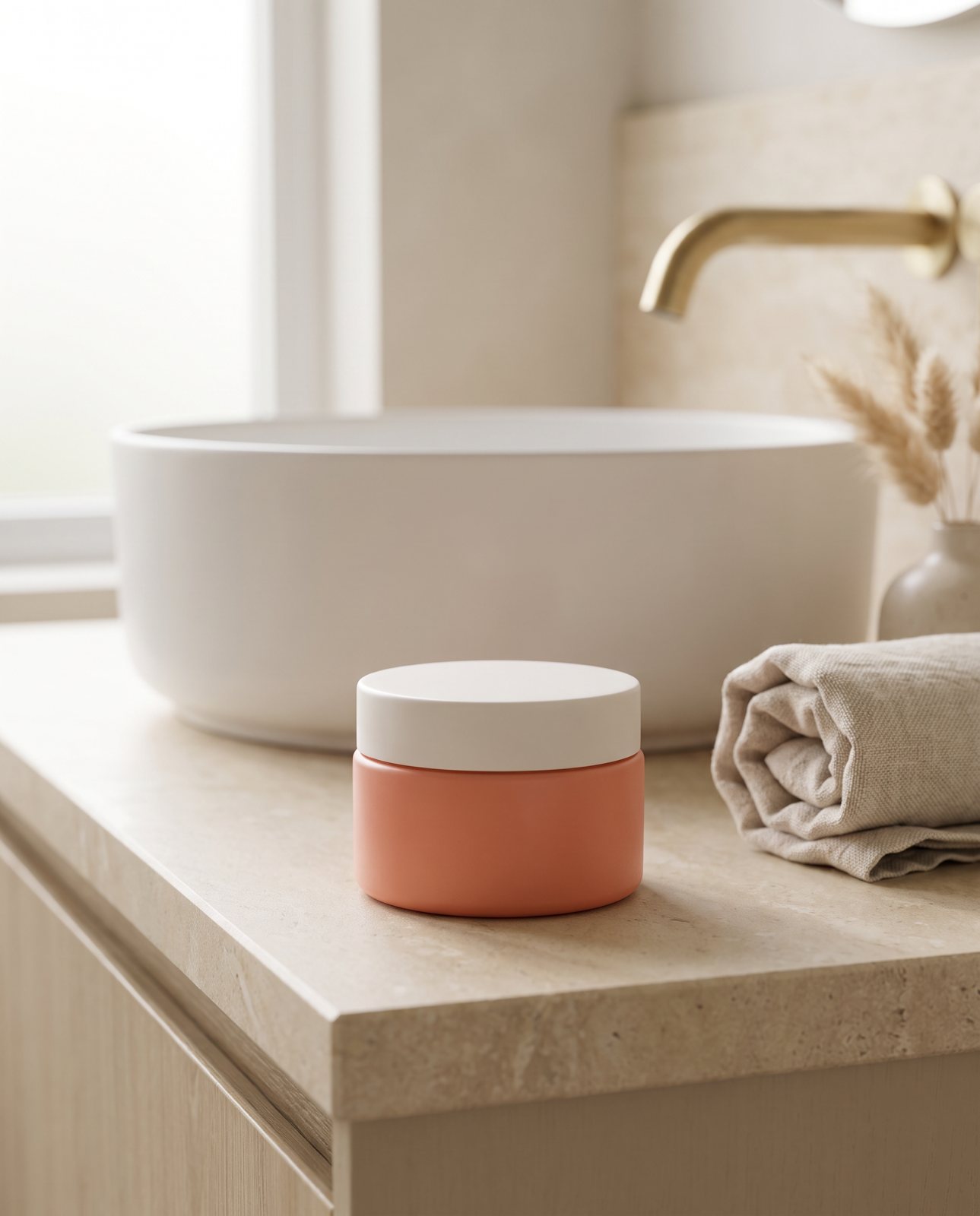
Two of the scenes we use in our own demo are a spa bathroom counter and a pastel studio set with blocks. They sit at opposite ends of that mood range, which is exactly why they're useful to compare. One is soft and quiet and a bit grown-up; the other is cheerful and graphic.
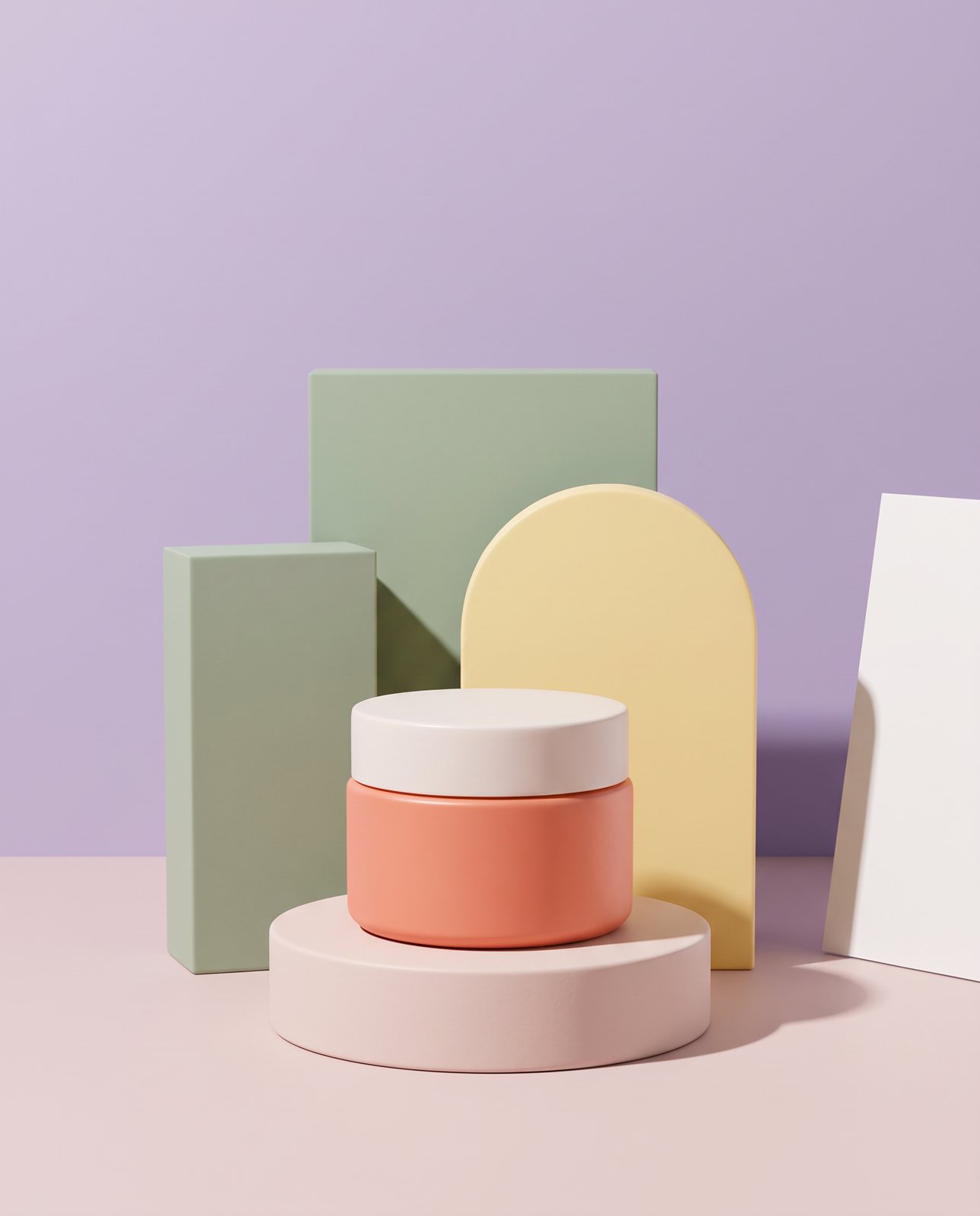
A pastel studio set for the same jar, made from the one starting photo.
Shots to take for a skincare range
A single hero photo isn't enough for a skincare listing. Buyers want to look around the product the way they'd turn it in their hand in a shop. Here's a sensible set, written out as a flow rather than a rigid checklist.
Begin with the front: the jar or bottle straight on, label facing the camera, clean and central. That's your main image and the one that appears in search. Follow with a three-quarter view, turned a little so you can see the shape and depth of the pack. It gives the product some dimension.
Then take a lid-off shot to show texture, if your product is happy being opened. This is the one that does the "can't touch it" work: a creamy surface, a rich balm, a light gel. A scale shot with a hand holding the jar tells people how big it really is, which is a surprisingly common question. If you have a whole range, do a group shot with the products lined up together, so buyers see how they sit as a family. And add a lifestyle scene, the product sitting on a bathroom shelf or beside a basin, so people can picture it in their own home.
The thing that holds all of this together is consistency. Keep the same light and the same camera distance across every product. If the cleanser is shot close and the toner is shot far away, the range looks uneven even if each picture is lovely on its own. Set up once, shoot everything, and resist the urge to adjust halfway through.
If you're planning the wider listing, including how many images to aim for and how to order them, the ecommerce product photography guide covers that side of things. And where a particular platform has its own rules about images, check that platform's own help page rather than going from memory.
How Product Photo Shots helps (and what it doesn't do)
Right, our bit, and I'll try to be straight about it, including the parts that don't work.
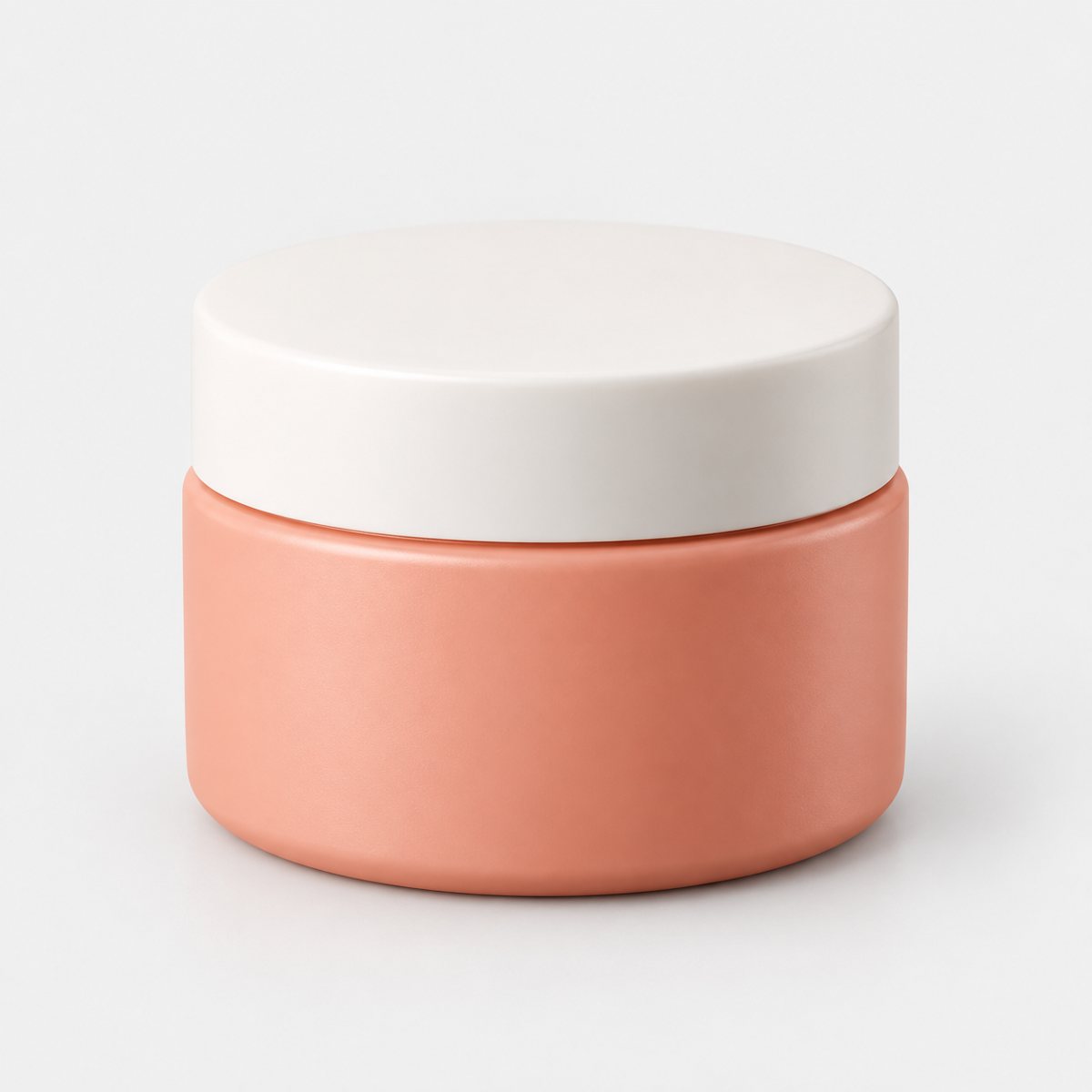
Here's what we do: we start from your one photo of the jar and put it into new scenes. You give us a clean picture of the real product, and we build fresh settings around it, like a spa bathroom or a pastel studio set. It's a way to get that range of shots without building every set yourself.
Before you pay anything, we study your photo and list what must stay the same: the colour, the shape, the lid, the details that make the product that product. That check is free and takes about a minute (our precheck measured 11 seconds on 2026-10-01). Then, if a shot changes the product, we remake it with a specific fix, up to three attempts in all. If it's still wrong after that, a person checks it, and it is never delivered as is. You also get one free redo per delivered shot.
Skincare is exactly where this gets tested, because colour drift shows up so easily. In our demo run we took a soft coral cream jar with a plain white lid and put it into three scenes: a spa bathroom, a wet stone beside a pool, and a pastel studio set. Two of the three were delivered. The spa bathroom shot needed a remake: the first attempt was rejected for colour drift, and a second attempt was also rejected before the delivered shot. The wet stone beside the pool failed all three attempts, again on colour drift, and it was never delivered.
That last one looks like a failure. I'd argue it's the check doing its job. A pool scene with a jar that had drifted from its real colour could look fine at a glance and then disappoint a real buyer. Better to hold it back. Across the whole demo run (10 products, three scenes each, 30 shots in all) 27 were delivered and 3 were held back by the check.
Some things we won't pretend to do. We don't photograph the texture of the cream itself, so for that lid-off, creamy-surface shot you'll want to take it yourself. We don't promise close-ups of small label text: in one of our tests, small printed text came out garbled on most shots. And we can only shoot products you own or sell: well-known brands' products can't be shot, because the image services refuse them, and we tell you that before you pay.
Every shot is reimagined with AI and labelled as such, and the files carry standard AI-provenance metadata. No sneaking about. If you want the bigger picture of how this sort of thing works, there's more in our AI product photography guide.
On cost, prices include VAT. Three shots are £19 (£6.33 a shot), five shots are £29 (£5.80 a shot), and ten shots are £49 (£4.90 a shot). If you need more, a custom pack of 11 to 40 shots is £4.50 a shot.
A few materials are harder than others. Besides the coral skincare jar, amber perfume also drifted in colour (one perfume attempt was rejected as "colour wrong"), and brushed steel picked up its surroundings, with two steel bottle scenes failing all three attempts and never being delivered. So if your packaging is a tricky colour or finish, expect the check to be strict with it.