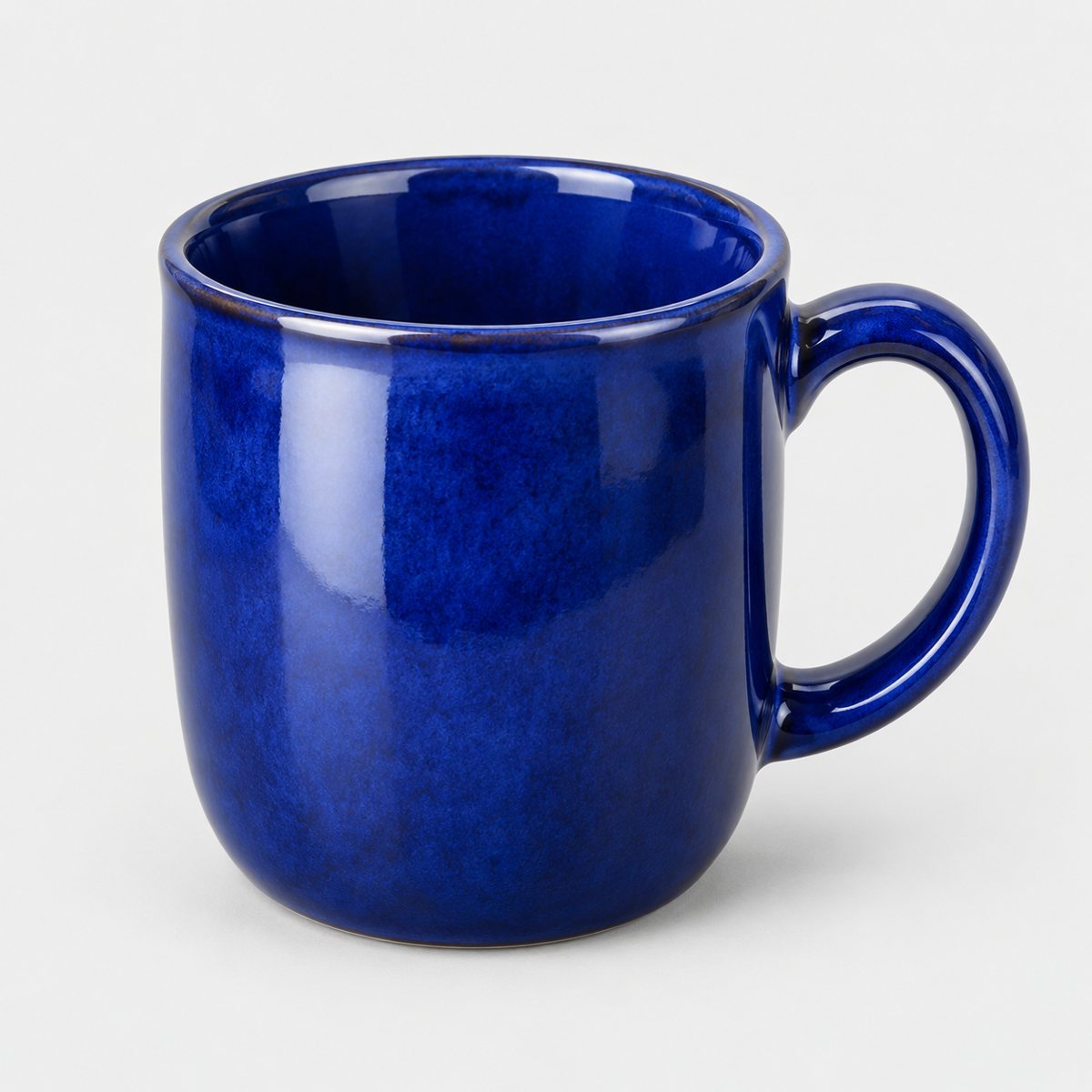

The short answer
Put a table beside a window. Stand a curved sheet of card behind it as a backdrop, set the product forward of the card, and put the camera on something steady at product height. Then use that exact arrangement for every product you shoot.
That's the whole method. Everything below is detail, and the detail matters because the set-up is only half the job. The other half is repeating it without drifting, so that your tenth product looks like it belongs with your first. If you sell on Etsy, Shopify or Amazon, that consistency matters as much as any single clever shot.
The table-top layout
Picture the set-up from above, as a plan. Easier to follow that way, and easier to copy.
The window is on one side. It's your light, and it's free. The table sits at right angles to the window, so the light falls across the product from the side rather than straight on or from behind. At the back of the table, the backdrop: a sheet of card, curved up behind the product. On the far side from the window, opposite the light, a white card reflector. That one is just a piece of white card propped upright, and its job is to bounce a little window light back into the shadows so they don't go heavy and dark. The camera sits in front of everything, looking at the product.
Two rules inside that plan. First, keep the product away from the backdrop. Pull it forward, a good hand's width or more, so the card falls slightly soft behind it and the product doesn't throw a hard shadow onto the wall of the set. Second, turn the room lights off. Ceiling bulbs are a different colour from daylight, and mixing the two gives you a muddy, yellowish cast that's annoying to fix afterwards. One light source, the window, is plenty.
If you want to go deeper on how light behaves and how to shape it, the product photography lighting guide covers it. For a table-top at home, though, the window and a white card will carry you a long way.
Surface and backdrop
Start with the surface. It needs to be clean, flat and matte. A glossy tabletop reflects the window, the ceiling and you, and every one of those reflections becomes something you have to explain away later. A plain wooden table or a sheet of paper works fine. So does a matte board. Wipe it down before every session, because dust and crumbs show up in photos that looked spotless to the eye.
Now the backdrop. Use a sweep of card with no horizon line. That means the card runs along the table and then curves up the back in one continuous bend, so there's no sharp edge where table meets wall. A visible horizon line pulls the eye straight to it and makes the whole picture feel like a product sitting in a room rather than a product on its own. The curve fixes that. It gives you a smooth gradient behind the product and nothing to distract from it.
Choose a matte card for the same reason you chose a matte surface: no glare, no hotspots. Pale, neutral colours are the safest, since they're forgiving and they let the product do the talking. If you want to think harder about colour, texture and what suits which product, the backdrops guide goes into it properly.
Tape the card down at the back and along the sides so it stays curved and doesn't creep. A loose sheet will slump halfway through a session, and you won't notice until you're editing.
Camera position and keeping it steady
Hand-holding is where good set-ups go to die. Even a steady hand drifts a few millimetres between shots, and that's enough to ruin consistency across a batch. So give the camera a proper support.
A tripod is the obvious answer. But it's not the only one. A stack of books works. So does a pile of boxes, or a sturdy shelf at the right height. Anything solid that holds the camera still and lets you set a height you can return to. If you're using your phone, the same logic applies, and the iPhone product photos guide walks through it.
Then stop touching the camera when you press the button. Use the timer, or a remote if you have one. Pressing the shutter by hand shakes the camera slightly, and that tiny movement softens the image. A short timer removes most of the problem.
Put the camera at product height, looking level at the product, not down on it from above and not up from below. A slight downward tilt makes small items look squashed and distorts their shape, and it's hard to spot until you compare against a properly level shot.
Distance matters too. Stand back and zoom in slightly rather than moving close with a wide lens. Getting close with a wide lens bends the proportions: edges stretch, rounded things bulge, and products look subtly wrong. Backing off and zooming in flattens that out and gives you a truer shape.
Finally, lock focus and exposure. If your camera or phone lets you fix both, do it. Otherwise it'll hunt and adjust between frames, and the brightness will wander from shot to shot. Lock them once the product is in place and leave them alone.
A repeatable routine for many products
One product is easy. Thirty is where most people's consistency falls apart. The fix is a routine, and it's dull, which is exactly why it works.
So, mark everything. Put tape on the table where the product goes. Put tape where the tripod legs or the book stack sits. Mark where the reflector stands. Once those positions are fixed, you can swap products in and out and the framing, the light and the distance all stay the same. That's what makes a shop grid look like one brand rather than a mix of different pictures.
Shoot all your products in one sitting. Daylight changes through the day: the colour shifts, the brightness rises and falls, a cloud moves in. If you photograph half your range in the morning and half in the afternoon, the two halves won't match, however carefully you set up. Pick a window of time when the light is steady and get everything done inside it.
Clean each product before it goes on the table. Fingerprints, lint and dust are far easier to wipe off than to retouch. A quick check with a soft cloth saves you a lot of tedious editing later.
And keep your file names tidy from the start. Name each file with the product and the shot, so you're never guessing which of two hundred near-identical images is the back view of the blue mug. It feels fussy when you're doing it. It feels brilliant three weeks later when you're uploading listings.
The set of shots to take
Think of a standard set of shots for every product, so nothing gets forgotten and every listing looks complete. Here's a list that covers most things:
- Front view, straight on.
- Side view.
- Back view.
- A three-quarter angle, turned so you see the front and one side together.
- A detail or texture close-up: the weave, the stitching, the finish.
- A scale shot, with a hand or a familiar object beside the product so buyers can judge its size.
- The packaging.
Each one answers a question a buyer would otherwise have to ask. The front, side and back show the whole object. The three-quarter angle gives it depth. The close-up proves quality. The scale shot stops the "how big is it really?" message. The packaging tells people what turns up at their door, which matters most for gifts.
Shoot more than you need. Memory is cheap and a reshoot isn't. It's far easier to pick the best seven from twenty than to rebuild the set-up for one missing angle. Take a few spares of each view, with tiny variations, and you'll almost always have a keeper.
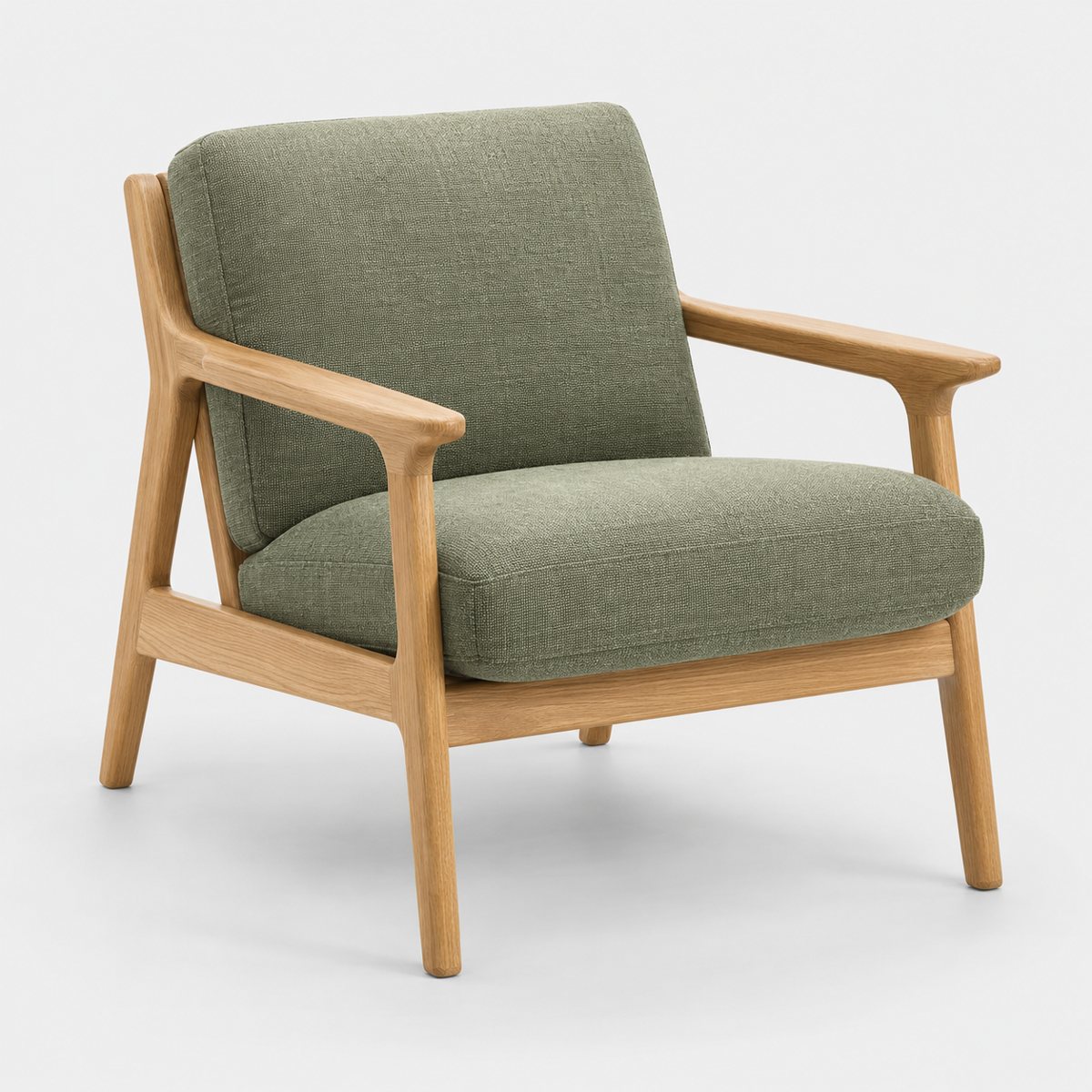
The whole product in frame with space around it: a photo like this can be cropped to any shape later.
Props and styling
Props are optional, and the temptation is to overdo them. Resist it. One or two is plenty, chosen to say what the product is for. A candle might sit beside a matchbox. A mug might have a spoon resting next to it. A notebook might have a pencil. The prop should explain the use at a glance and then get out of the way.
Nothing should compete with the product. If your eye goes to the prop first, the prop is too loud or too large. Keep colours calm and the scale small, and let the product clearly be the hero of the frame.
There's a rule worth checking too. Some platforms forbid showing items that aren't included in the sale, because buyers can assume a prop comes with the product. So before you style anything, look at the platform's own help page for what's allowed in listing images. Rules differ and they change, so don't rely on memory or on what another seller told you. Check the source.
How Product Photo Shots helps (and what it doesn't do)
Straight answer: the set-up on this page makes the source photo. Product Photo Shots makes the scenes from it. That's the division of labour.
What we don't do is photograph your product for you, and we don't make plain white packshots. If that's what you need, the table-top above is how you get it yourself.
What we do is take your good photo and put the product into a new scene. You can put the product in a new scene without rebuilding a set every time. Here's how it works in practice.
Before you pay, we study your photo and list what must stay the same about the product. That check is free and takes about a minute (our own precheck measured at 11 seconds on 2026-10-01). It's there so you know what we're protecting before any money changes hands.
If a shot changes the product, it's remade with a specific fix, up to three attempts in all. If it's still wrong after that, a person checks it. It is never delivered as is. You also get one free redo per delivered shot.
Shots come in four shapes: square 1:1, portrait 4:5, story 9:16 and wide 16:9. Every shot is reimagined with AI and labelled as such, and the files carry standard AI-provenance metadata.
Pricing is simple. Three shots cost £19 (£6.33 a shot), five cost £29 (£5.80), and ten cost £49 (£4.90). A custom order of 11 to 40 shots is £4.50 a shot. Prices include VAT.