The short answer
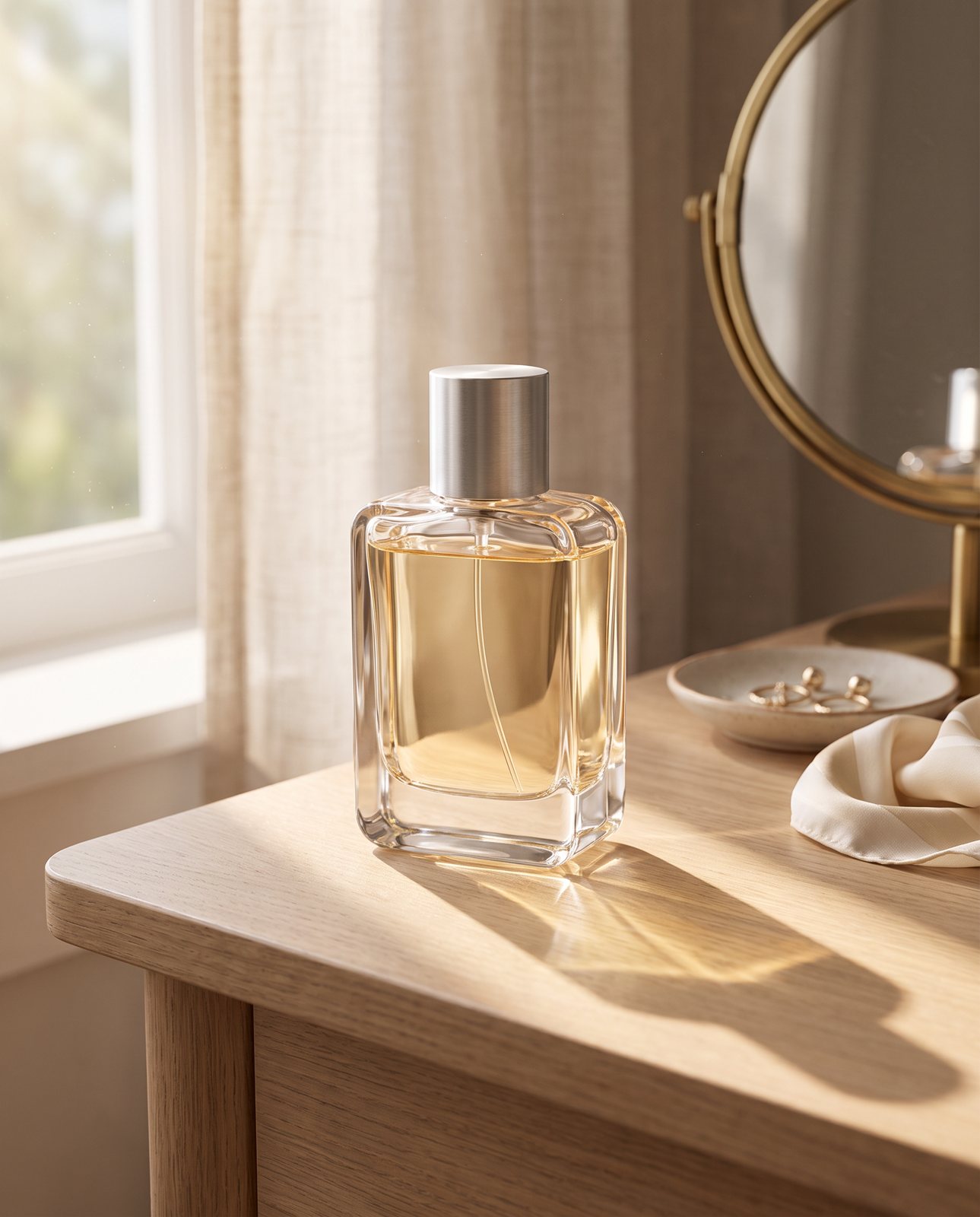
Use one big, soft light from the side. A window is ideal. Put a sheet of white card on the opposite side of the product to lift the shadows. Don't use flash, and use one colour of light at a time, so switch off the room lamps and let the window or your chosen lamps do the work alone.
That's it. Everything else in this guide is detail on those four moves: where to put the light, how to soften it, how to fill the shadows and what to do when your product is shiny, dark or white. If you only read this section and try it, you'll have the main part.
Soft light and hard light
Light is soft or hard depending on its size, its distance and what's in the way. Get those three right and the rest follows.
Soft light comes from a source that's large compared with the product. It's also close, and it's diffused, meaning it's passed through something like a thin curtain, tracing paper or a softbox panel. An overcast sky is the classic example: a huge, even source. Shadows from soft light fade gently at the edges. Texture shows, but doesn't shout. Glare spreads out and mostly disappears.
Hard light is the opposite. Small source, far away, direct. Think bright sun through clear glass, or a bare bulb on a stand. Shadows turn crisp and dark. Texture gets exaggerated, which can be lovely on a rough ceramic and awful on a knitted jumper. And glare? You'll find it on anything with a shine, as a hard white hotspot you can't edit away.
So which should you pick? Soft, almost every time. To be fair, hard light has its place: a moody, high-contrast shot of a leather wallet, say. But if you sell more than one kind of product, or you want a set of photos that look like they belong together, soft is the safe choice. It forgives small mistakes in positioning. It flatters most materials. And it's far easier to repeat next week.
One rule of thumb helps here. The bigger the light looks from where the product sits, the softer it is. A small lamp across the room is hard. The same lamp pushed close and shining through a diffuser gets softer fast. Move closer, make it bigger, soften it.
Window light
A window is the best free studio you'll ever have. Use it.
Pick the right one first. A north-facing window, or any window that stays in shade, gives steady, even light that changes slowly. Direct sun is a different story. It's hard, it's harsh and it moves across the room while you work. If direct sun is the only light you've got, cover the glass with a thin white curtain or a sheet of tracing paper taped to the pane. That turns a small bright sun into a big soft panel. Simple trick, big difference.
Set the product on a table beside the window, so the light falls across it from the side rather than straight on. Then turn off the room lights. This matters more than you'd think. Ceiling bulbs are usually a warmer colour than daylight, and the mix gives you a yellow patch on one side of the product and a blue-ish cast on the other. One colour of light at a time.
Watch the clock, too. Light through a window changes colour and strength through the day: cooler and flatter at midday, warmer and lower towards evening, brighter or dimmer every time a cloud passes. That's why you should shoot a whole set in one sitting. If you photograph your first three products at ten in the morning and the next three at four in the afternoon, the set won't match, and a shop page full of slightly different whites looks messy even when each photo is fine on its own.
Cloudy days are your friend. Thin, even cloud acts like a giant diffuser over the whole sky. If it's a bright, clear day, wait, move to a shaded room or hang your curtain.
Lamps and artificial light
No decent window? Fair enough. Plenty of flats and workrooms don't have one. Lamps will do the job, as long as you treat them with some care.
The setup is two matching lamps, or two matching bulbs, balanced for daylight. The label on the packaging will say so. Matching matters: two different bulbs in the same set give you two different colours of light, and your product will pick up both. Put a diffuser in front of each. That can be a softbox panel, a sheet of tracing paper held a safe distance from the bulb, or a thin white fabric. Never let paper touch a hot bulb. Keep it clear of the heat and use cooler bulbs where you can.
Here's the part people skip. Never mix your daylight lamps with warm room bulbs. Close the curtains, switch off the ceiling light, and let the lamps be the only light in the room. Mixed colour is a common reason product photos look off, and it's a nightmare to correct afterwards because different parts of the image need different fixes.
And keep every product in a set under the same lamps, in the same positions. Mark the floor or table with a bit of masking tape so you can put the lamps back exactly where they were. If you photograph a candle on Monday and a mug on Thursday, with the lamps in slightly different places, the two will look like they came from different shops. Consistency isn't glamorous, but it's what makes a catalogue look professional.
You don't need to spend much on any of this. Plenty of sellers get by with cheap, ordinary lamps and a bit of diffusing material. What counts is that the lights match and the colour stays steady.
Where to put the light
Place the light before you place anything else. Position decides the look.
Side light, at roughly 45 degrees to the product and a little above it, is the workhorse. It gives shape and texture: you see the curve of a bottle, the weave of a fabric, the grain of a wooden board. It also gives a soft shadow on the far side, which makes the product feel solid rather than stuck on the page. If you're unsure, start here.
Back light, from behind the product and a little to one side, does two special jobs. It makes translucent things glow: glass, thin candles, jam jars, anything where the light can pass through. And it creates a bright rim around the edge of an object, which separates it from the background. Use it on its own for drama or with a little front fill to keep the face of the product readable.
Front light, from beside or behind the camera, flattens everything. Shadows vanish, texture disappears and the product looks like a cut-out. It's tempting, because it's bright and nothing looks wrong. But it's rarely flattering. Use it only when you need to see every detail and shape doesn't matter, such as a flat print or a label.
One habit will save you a lot of frustration: move the light, not just the product. Turning a jar a few degrees on the table changes the angle of the reflection but not the angle of the light. Slide the lamp, or slide the table, and watch what happens. And start with one light. Add a second only when you can say exactly what's missing from the first. Most home setups work better with fewer lights, not more.
Fill, reflectors and shadows
Side light leaves one side of the product darker. That's what gives it shape. But sometimes it's too dark, so you lift it with fill.
Fill is simple. Prop a piece of white card or white foam board on the side opposite the light, just out of frame, angled to bounce light back onto the product. Move it closer and the shadows lift more. Move it away and they deepen. Two minutes of fiddling here is worth more than an hour in editing.
Want the opposite? Use black card. It soaks up light instead of bouncing it, so the shadow side gets darker and the shape stronger. That works well on bottles, glassware and anything you want to look sleek. Black card also stops stray reflections on shiny things, which we'll come to.
Now the part people overcorrect. Don't kill every shadow. A soft shadow under and just beside the product makes it look grounded, as if it's really sitting on the surface. Remove it completely and the item seems to float. If you plan to put it on a white background later, keep a hint of contact shadow. It reads as real.
Before you press the shutter, check where the shadow actually falls. Look at the edges of the frame, behind the product and underneath it. A neat shadow can turn messy if it stretches across the label or runs into a prop. Small shifts of the lamp or card fix most of these problems. Check, adjust, check again. It takes seconds.
If you're shooting for a white background, the same lighting rules apply, with a few extra steps. Our guide to white background product photography covers those. And if your camera is a phone, product photos with an iPhone has the practical settings.
Lighting shiny, dark and white products
Some products fight back. Here's how to deal with the three hardest types.
Shiny and metal. Glossy surfaces act like mirrors. They don't show their own colour so much as everything around them: the window, the ceiling, you, your camera. So use a large, soft source and put white card where you'd otherwise see clutter. Then move. Shift the product, the light or your camera angle a little at a time until the reflection looks clean and smooth rather than messy and distracting. It's slow, and it's the only method that works.
Brushed steel is the honest example. In our own testing, brushed steel kept picking up its surroundings, and two steel bottle scenes failed all three attempts and were never delivered. That's useful to know even if you never use our service: brushed steel mirrors whatever surrounds it, in a real photo as much as in a generated scene. Clean, controlled light on the original makes everything downstream easier.
Dark products. Black bottles, dark leather and charcoal fabric swallow light, and the shape disappears into the background. Give them a little more light on one edge: a slim strip of brightness along the side or top that outlines the form. A back-and-side light does this well. Don't flood the whole product with light, or it turns grey and flat.
White products. White on white vanishes. The fix is the reverse of the dark case: add a darker side or edge so the outline shows. Black card on one side, or a slightly darker surface, gives the edge something to stand against. Keep the light soft, and watch the highlights so they don't blow out into pure white with no detail.
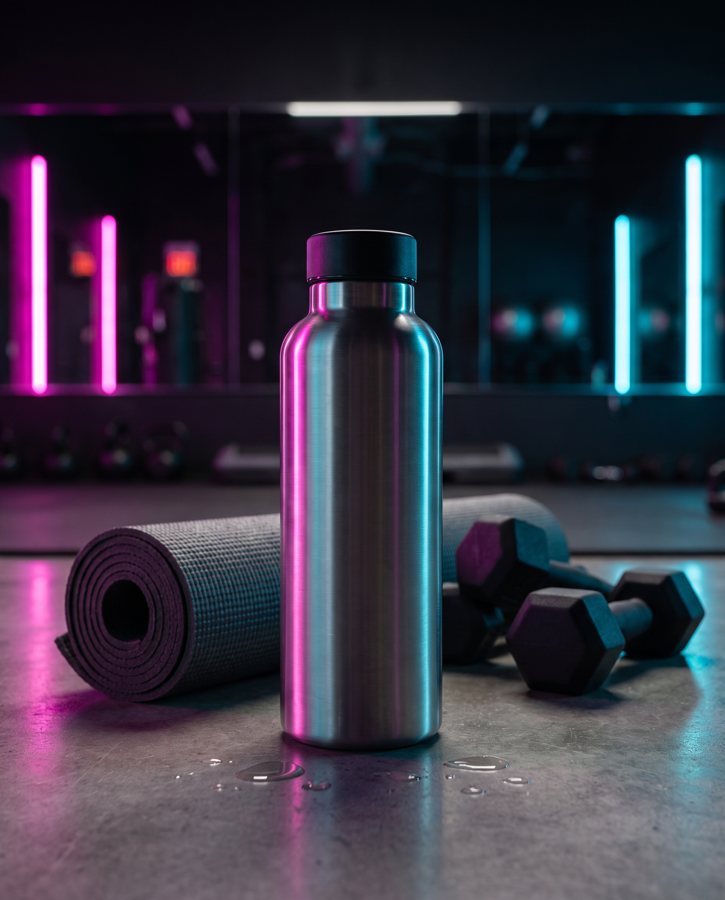
Brushed steel takes on whatever is around it. In our demo run, two steel bottle scenes failed all three attempts for this reason and were never delivered.
How Product Photo Shots helps (and what it doesn't do)
Honest version, short. A well lit photo gives us the best starting point, and everything above is about getting there.
Before you pay, we run a free check. We study your photo and list what must stay the same, such as the shape, the colour and the label. It's free and takes about a minute (our precheck measured 11 seconds on 2026-10-01). We also flag glare at that stage, so you hear about it early.
What we do is make scenes from a photo. You can put the product in a new scene and choose the shape you need: square 1:1, portrait 4:5, story 9:16 or wide 16:9. If a shot changes the product, we remake it with a specific fix, up to three attempts in all. If it's still wrong, a person checks it, and it's never delivered as is. You also get one free redo per delivered shot. Every shot is reimagined with AI and labelled, and the files carry standard AI-provenance metadata.
Some things are harder. In the same demo run, colour drift held back or needed extra attempts on a coral skincare jar and on amber perfume, where one perfume attempt was rejected as "colour wrong". Brushed steel, as above, picked up its surroundings.
What we don't do: we don't rescue a dark or badly lit photo, and we don't light a studio for you. Packs run from 3 shots at £19 (£6.33 a shot) through 5 shots at £29 (£5.80) and 10 shots at £49 (£4.90), with custom orders of 11 to 40 shots at £4.50 a shot. Prices include VAT.