The short answer
A product page needs a clear main image of the whole product, two or three more angles, one detail shot, one scale shot and one or two lifestyle scenes. That's the set. Keep the light, the crop and the background the same across your catalogue, and you've covered most of what a buyer wants to see.
So why does it matter? Because a buyer can't pick the thing up. Every photo on the page answers a question they would otherwise ask in a shop. Skip a shot and you leave a question hanging, and a buyer with an unanswered question has less reason to trust the page. The rest of this guide goes through each shot, why it earns its place, and how to produce the lot without losing your mind.
The shots a product page needs
Think of the set as a short conversation with the buyer. Each image answers one question, in roughly the order they'll ask it.
- The main image. What is it? This is the whole product, clear and uncluttered. It does the first job of the page, and it's the one that shows in search results and category grids.
- Two or three angles. What does it look like from the other sides? Front, back, side, top, whichever reveal something. If the back has a pocket or the base has a feature, show it.
- A detail shot. How does it look up close? Texture, stitching, a clasp, a printed label. This is where quality either shows or doesn't.
- A scale shot. How big is it? A hand holding it, or a familiar object beside it. Measurements in the description help, but a picture lands faster.
- A lifestyle scene. What's it like in use? A buyer wants to picture it on their shelf, their wrist or their kitchen counter.
- A packaging or contents shot. What is in the box? If it arrives with extras, a charger, a spare part or a gift tin, show them laid out. Nobody likes a surprise that turns out to be an absence.
Not every product needs all six. A flat print doesn't need a contents shot. A set of ten pieces absolutely does. Use the list as a checklist, then cut what doesn't apply.
The main image
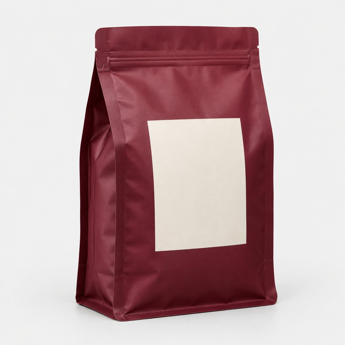
This is the one that does the heavy lifting. It should show the whole product, clearly, with nothing around it competing for attention. No props, no busy surface, no clever shadows that swallow an edge.
Here's the part sellers forget. The main image rarely appears at full size. It shows up as a small thumbnail in search results and as one tile in a category grid, shrunk down alongside dozens of others. A photo that looks lovely on your screen can turn into a grey smudge at that size.
So check it as a thumbnail. Shrink it right down, or look at it on your phone held at arm's length. Can you still tell what the product is? Can you see its shape and its colour? If you squint and can't, the shot isn't working yet.
A few habits help:
- Fill the frame sensibly. Too much empty space makes the product tiny when the image shrinks.
- Keep the edges crisp. Soft, fuzzy outlines disappear first.
- Watch contrast. A pale product on a pale background fades fast at small size.
- Show the product at its most recognisable angle, the one a buyer would expect.
Fair enough, that's a lot of fussing over one picture. But it's the picture that decides whether anyone clicks through to see the rest.
Detail, scale and in-use shots
These are the shots that help a browser decide. The main image says what it is. These say whether it's right for them.
Detail. Get close. Show the texture of a fabric and the finish on a ceramic glaze. Add the fixings on a bag, plus the label with its care instructions or materials. Close-ups prove quality in a way a description can't, and they head off the "does it feel cheap?" worry before it starts. Use good light, hold the camera steady and make sure the focus lands on the thing you're showing, not the background behind it.
Scale. A product floating on a plain background has no size. It could be the size of a coin or a coffee table. Fix that with a hand holding it, or a familiar object next to it: a mug, a pen, a coin, a phone. Pick something your buyer will instantly recognise, and keep it simple. The object is there to give size, not to steal the show.
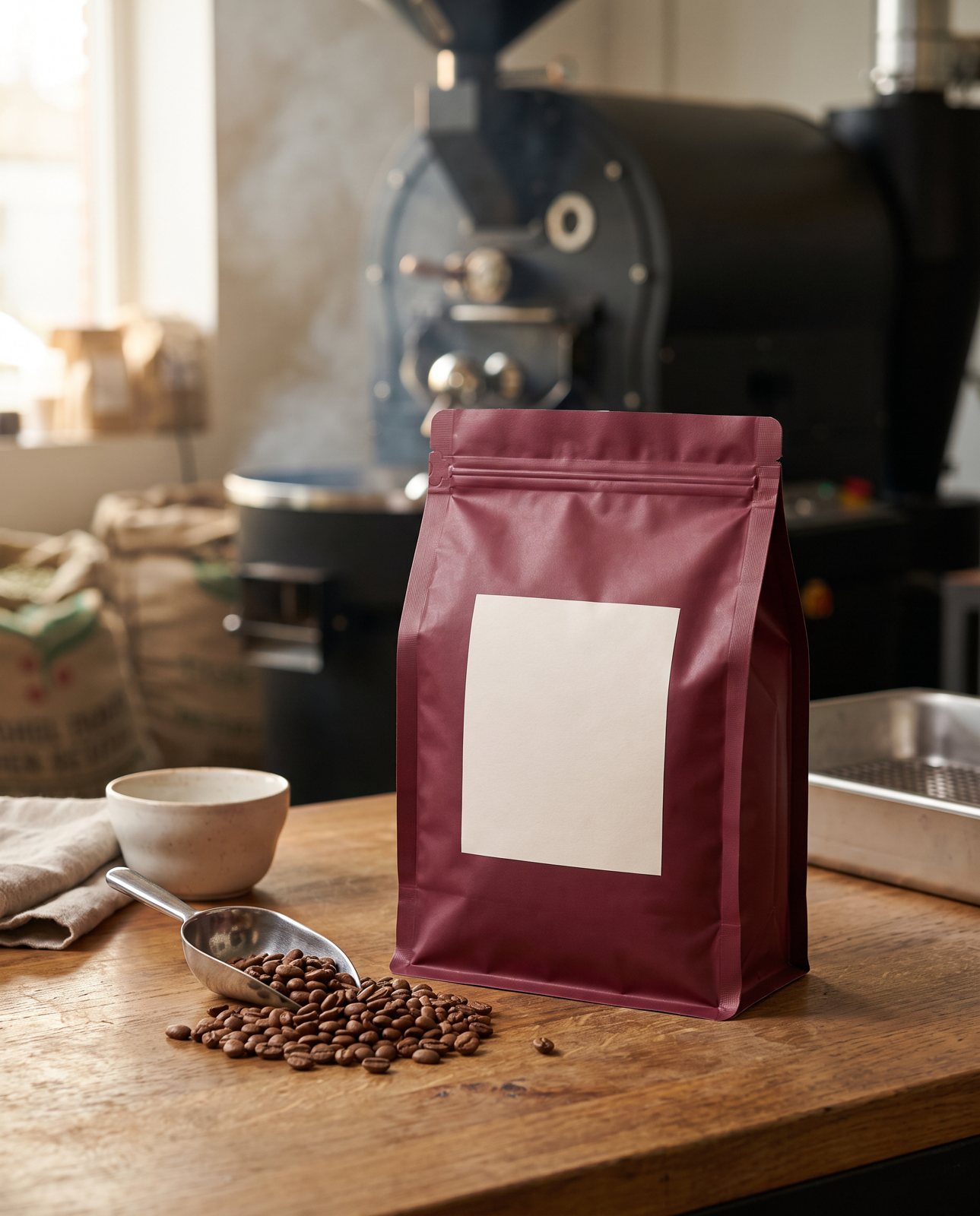
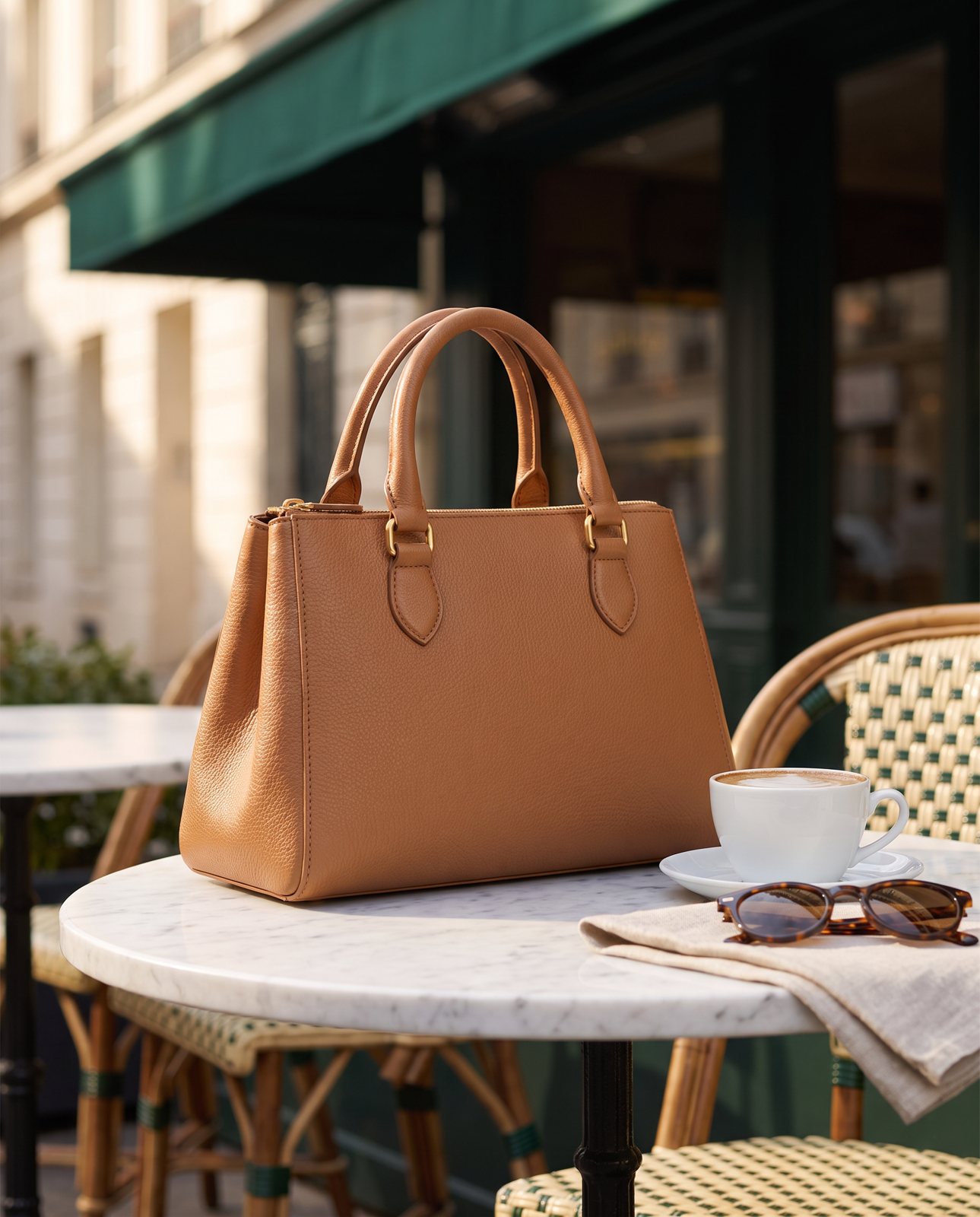
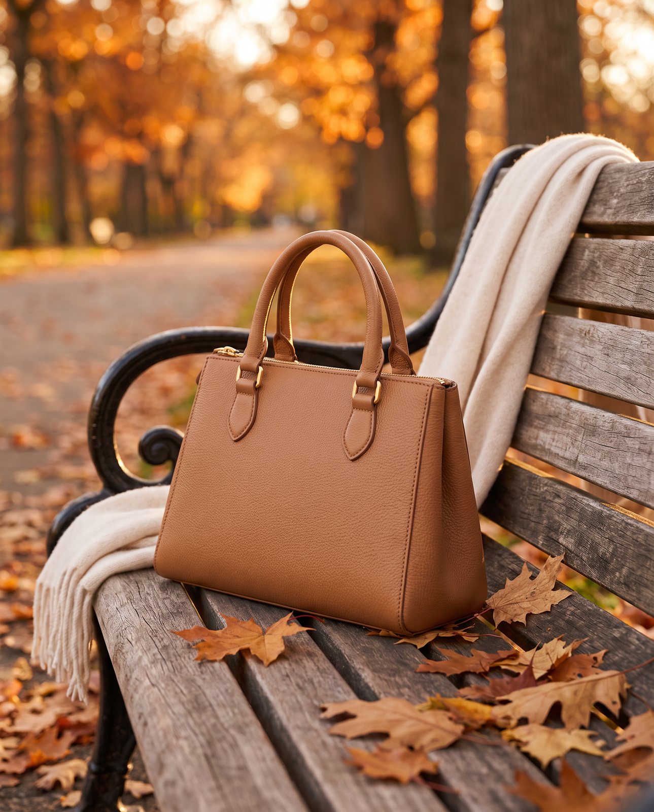
In use. This is the lifestyle scene. Put the product somewhere real: a candle on a shelf, a bag over a shoulder, a print on a wall, a mug on a desk. The aim is to let the buyer picture it in their own life. You don't need a dozen of these. One or two good scenes beat six mediocre ones. For more on how to think about them, there's a separate guide on lifestyle product photos.
A word of warning: every scene must show the product accurately. If the colour shifts, or the shape changes, or a detail goes missing, you've created a gap between the photo and the product. The picture should match the title and the product that turns up at the door.
Consistency across a catalogue
Here's something that doesn't get said enough. A single good photo helps. A whole shop of matching photos builds trust.
When a buyer scrolls a grid and every tile looks like it belongs to the same family, the shop feels like a proper business. When the tiles are a patchwork of different crops, different backgrounds and different light, it feels haphazard. Fair or not, that's how people read it.
So for the main images of a range, lock down four things:
- Crop ratio. Pick one shape and stick with it. Mixing tall and wide images in the same grid creates a ragged, uneven look.
- Light direction. If the light falls from the left on one product, it should fall from the left on all of them. Shadows pointing different ways make a range look pieced together.
- Background colour. Same colour, same tone, every time. This does a lot to make a grid look tidy.
- Distance. Shoot each product at about the same distance, so they fill the frame by a similar amount. Otherwise a tiny earring looks bigger than a large vase.
You don't need to be rigid about every shot on the page. Detail and lifestyle images can vary; that's the point of them. But the main images, the ones that sit side by side in a grid, are the ones that need to match. Get those right and the whole catalogue looks calmer and more confident.
Platform rules come first
Before you plan anything, read the rules. Each marketplace and shop builder has its own requirements for image sizes, backgrounds and file types, and they change. What's accepted today may not be accepted next year.
That's why this guide doesn't quote any of them. Numbers go out of date, and a wrong number is worse than no number. Go to the platform's own help page and read what it says now.
To make that easier, we've written guides that point you to the right place for each of the big three:
Treat the platform's rules as the boundary and everything else in this guide as what you do inside it. If a marketplace asks for a particular kind of main image, that wins over any tip about style. Get the main image compliant first, then spend your creative effort on the supporting shots, where you've got far more freedom.
Planning and producing a catalogue
Shooting one product is easy. Shooting a catalogue is a logistics problem, and the sellers who cope best are the ones who plan it like one.
Batch by product type. Group similar items and shoot them together. All the mugs, then all the bags, then all the prints. The set-up stays the same, so you're not rebuilding your lighting for every item, and the results match without extra effort.
Shoot everything in one sitting. Light changes through the day and from one day to the next. If you spread a range across a week, you'll get a week's worth of different light. Do it in one go and the whole set looks like it belongs together.
Name your files. Do this as you go, not afterwards. A clear naming habit, product name, then angle, then a number, saves hours when you're uploading and when you're hunting for a shot six months later. Future you will be grateful. Present you will find it tedious. Do it anyway.
Keep an original untouched. Always save the raw, unedited photo somewhere safe. Edit a copy. If you need to recrop for a new platform or redo an edit, you'll be glad the original is still there.
Decide who gets lifestyle scenes first. You probably can't do every product at once. Start with your best sellers, the pages that get the most visits.
Weigh the cost. There are three broad routes: shooting it yourself, booking a studio, or using AI to make scenes. DIY saves money but costs time, and that time multiplies across a big catalogue once you count set-up, editing and file management. A studio gives you polish and costs more. Plenty of sellers mix the lot: a studio for the hero images, DIY for the long tail, AI for extra scenes. Our cost guide walks through how each route works.
How Product Photo Shots helps (and what it doesn't do)
To be fair, here's the honest version. We make the lifestyle and in-use scenes, from one photo of your product.
That's the job. You give us a clear photo, and we put the product into a new scene. If you want to understand how that works, there's a guide on how to put the product in a new scene.
Before you pay anything, we study your photo and list what must stay the same about the product. That check is free and takes about a minute. (We measured it at 11 seconds on 2026-10-01, so about a minute is the cautious estimate.) It's there so you know what we'll preserve before you spend a penny.
If a shot comes back with the product changed, we don't hand it over. We remake it with a specific fix, up to three attempts in all. If it's still wrong after that, a person checks it. It's never delivered as is. And if you simply don't like a shot we've delivered, you get one free redo per delivered shot.
Scenes come in four shapes: square 1:1, portrait 4:5, story 9:16 and wide 16:9. Pick the ones your platform and your social channels need.
Pricing is simple, and all prices include VAT:
- 3 shots for £19 (£6.33 a shot)
- 5 shots for £29 (£5.80 a shot)
- 10 shots for £49 (£4.90 a shot)
- Custom, 11 to 40 shots, at £4.50 a shot
Now the other side. We don't make the plain main image for marketplaces that require white. That shot needs to be a faithful photograph, and it's yours to take. We also don't photograph detail shots or packaging shots. Those need the real object in front of a real camera. Every shot we make is reimagined with AI and labelled as such, and the files carry standard AI-provenance metadata.
So we're one part of the set, not the whole of it.