The short answer
For square images, 2048 x 2048 px usually displays best. Shopify accepts product and collection images up to 5000 x 5000 px, or 25 megapixels, and each file must be smaller than 20 MB. Stay inside those limits and you're fine.
The size matters less than you'd think. The ratio matters more. Pick one aspect ratio for every main image, and the collection grid lines up. Mix them and it doesn't. That's the whole story, and the rest of this page fills in the detail.
Shopify's size limits and the recommended size
Here are the numbers, straight from Shopify:
- Product and collection images can be any size up to 5000 x 5000 px, or 25 megapixels.
- Each file must be smaller than 20 MB.
- For square product images, 2048 x 2048 px usually displays best.
Shopify gives the size limit two ways, in pixels and in megapixels: 5000 x 5000 px is exactly 25 megapixels.
So how do you work out megapixels? The formula is simple: width times height, divided by 1,000,000.
Take one of our own files. In our 2 October 2026 demo run, portrait 4:5 shots came out at 1,856 by 2,304 pixels. Multiply them: 1,856 x 2,304 is 4,276,224. Divide by 1,000,000 and you get about 4.3 megapixels. That's well under the 25 megapixel ceiling. The files themselves were PNGs of roughly 4 to 8 MB each, comfortably under 20 MB, and each shot also downloads as a full-size JPEG of well under 1 MB.
Now, bigger isn't better. Shopify automatically creates different sizes of every image you add: a large version for the product page, a compact one for collection pages. Your giant original is the source, not what shoppers download. Go far beyond what the largest display needs and you gain very little, while your upload gets heavier and slower to manage.
Going the other way is the real risk. A tiny file gives the theme nothing to work with. Zoom looks soft, the product page version looks blurry, and no setting can fix pixels that were never there. So aim near the recommended size, stay under the limits, and don't shrink your files to save space.
Aspect ratio: why your collection grid looks uneven
Aspect ratio is the relationship between an image's width and its height. A square is 1:1. A photo twice as wide as it is tall is 2:1. It says nothing about how many pixels you have, only about the shape.
Shopify says it plainly: when product images sit side by side on collection pages, they can display at different sizes. To make them display the same size, use a consistent aspect ratio for all your featured (main) images.
That's the usual cause of an uneven grid. You've got a square shot next to a portrait one next to a landscape one, and the row has to do something with the difference. Either the cards stretch to fit the tallest image, leaving gaps under the shorter ones, or the theme crops everything to a fixed shape and slices off the edges of the awkward ones.
Themes handle this in different ways. Some crop to a set shape. Some pad the image with empty space to fill the card. Some let each image keep its own proportions, which is exactly when the ragged rows appear. Shopify also notes that themes can use its CDN to request consistent sizing for images saved in different ratios.
Many themes have a product card image ratio setting in the theme editor. Go and check your theme's settings. Whatever it's set to, your uploaded images should match that shape as closely as you can manage. If the theme crops to square and you've uploaded portrait shots, the top and bottom get trimmed. If it's set to follow the image and your uploads vary, you get the uneven rows.
Which aspect ratio to choose
You've got three realistic options, and the right one depends on what you sell.
Square, 1:1. Simple. Works everywhere. It matches the 2048 x 2048 px that Shopify says usually displays best, and it behaves predictably across themes. If you're unsure, start here.
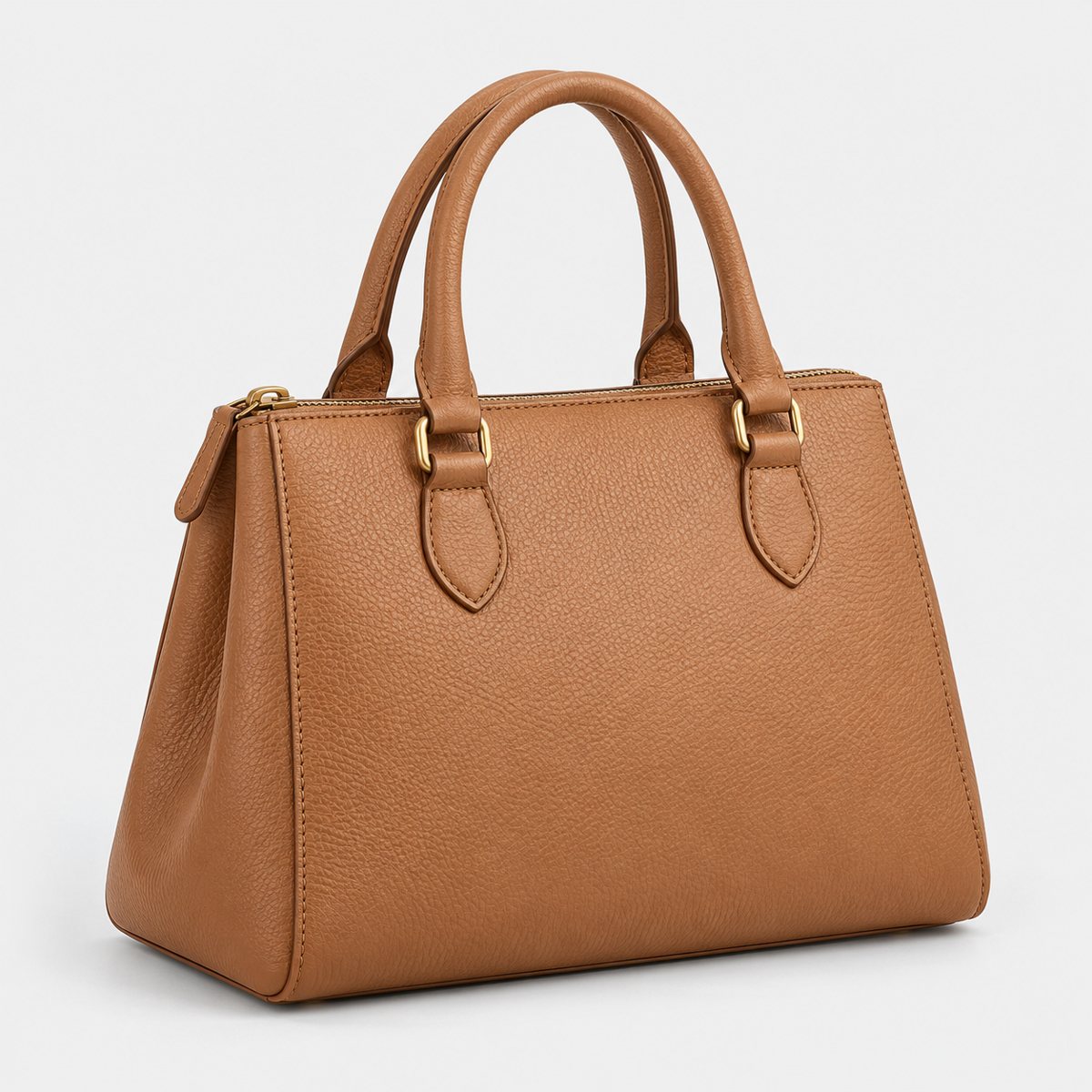
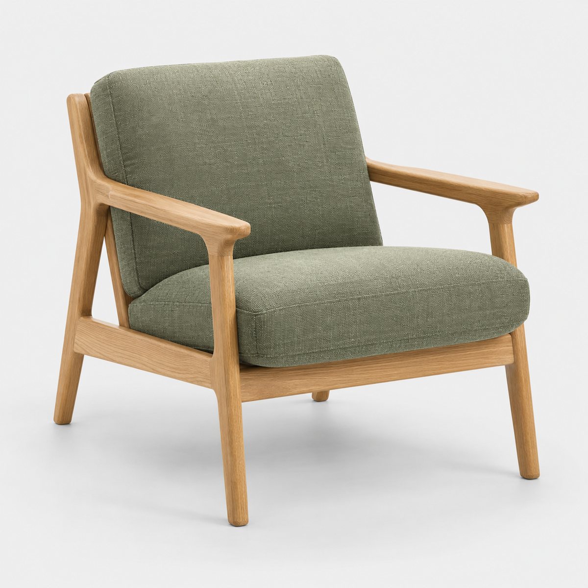
Portrait, 4:5. Taller than square, so it fills more of a phone screen. That's useful when most of your shoppers are on mobile. It suits products that are naturally tall or that benefit from room: fashion, bottles, furniture. Our own demo files used this shape, at 1,856 by 2,304 pixels.
Landscape. For wide products. Think of items that are far wider than they are tall, where a square or portrait crop would waste most of the frame on empty space above and below.
Now the rule. Use one ratio for every featured image across a collection. That first image is what appears in the grid, so that's where consistency pays off.
The gallery images that come after it on the product page can vary. A close-up detail shot and a wide room scene don't have to share a shape with the featured image. To be fair, consistency still looks better there too. A product page where every image sits at the same proportions feels calmer than one where the frame jumps around as you swipe. But the grid is where it counts, so start there.

Tall products like bottles fill a portrait 4:5 frame with less empty space at the sides than a square.
File type, file weight and page speed
Shopify accepts a lot of file types: PNG, JPEG, TIFF, BMP, GIF, SVG, HEIC and WebP. You're unlikely to be short of options.
Here's where it gets interesting. Shopify's two help pages give slightly different advice, and it's worth saying so plainly.
The Product media types page says the best file type for most product images is PNG, followed by JPEG. The Uploading images page describes JPEG as ideal for photographs, including product images, and PNG as ideal for logos, icons and graphics with flat colour or transparency. Both pages exist. They differ.
So what do you do? For photographs, export high-quality JPEG or PNG and don't lose sleep over it. Either is accepted, and either is fine. If your image has flat colour or transparency, lean towards PNG. If it's a straightforward photo, JPEG is a perfectly good choice.
On file weight, keep each file under 20 MB. That's the hard limit.
Then there's compression, and this is where people overthink it. Shopify says images don't need to be compressed before uploading; upload the best quality you can. Images aren't compressed on upload, but they may be compressed when served through the theme. And Shopify detects what each customer's browser supports and displays the best format available. In practice that means WebP or AVIF when the browser can handle them.
So Shopify handles the delivery side. You don't need to squash your files into the smallest possible size to protect page speed. Over-compress before you upload and you lock in the damage: the artefacts, the muddy edges, the banding in soft backgrounds. Shopify can't put the quality back. Upload the good version and let the platform do the shrinking.
That's why the advice is simple. Export high quality. Stay under 20 MB. Leave the rest to Shopify.
Colour profiles, cropping and focal points
Colour first. Colour profiles are removed when images are displayed on the store. Without a profile, browsers assume sRGB. So export in sRGB, and the colours you saw while editing are the colours shoppers see. Export in a wider profile and the image may shift once the profile is stripped: duller reds, flatter greens, a blue that's gone sideways. It's a quick setting to fix at export, and an annoying one to discover afterwards.
Cropping next. Even with a consistent ratio, themes crop. A product card might be a different shape from the product page, or the theme might change the proportions at different screen widths. Your main defence is a focal point.
Set one in the admin (Content > Files, the theme editor, or a product's Media section) and that point always stays in frame, even when a theme crops the image. Pick the product itself, or the part of it that matters most: the label, the face of the watch, the front of the chair. It's supported in Shopify's free themes, including the Horizon family and Dawn version 7.0.0 and higher. If your theme is older or from a third party, check its documentation for focal point support before you rely on it.
There's a second defence, and it costs nothing: leave space around the product. If your product fills the frame edge to edge, any crop slices into it. If there's a clear margin all round, the theme can trim the edges and the product survives. This is especially worth doing if you're mixing images that will be cropped to different shapes in different places.
So: sRGB on export, a focal point on every main image where your theme supports it, and breathing room around the subject. Three small habits, and the grid stops surprising you.
A checklist before you upload
- Stay within 5000 x 5000 px and 25 megapixels. Work out megapixels as width x height, divided by 1,000,000.
- Keep every file under 20 MB.
- For square images, aim for 2048 x 2048 px.
- Choose one aspect ratio for every featured image in a collection.
- Check your theme's product card image ratio setting in the theme editor, and match your images to it.
- Export photographs as high-quality JPEG or PNG. Use PNG for flat colour or transparency.
- Don't over-compress before uploading; Shopify handles delivery.
- Export in sRGB so colours hold after the profile is removed.
- Leave clear space around the product so crops don't cut into it.
- Set a focal point on each main image if your theme supports it.
How Product Photo Shots helps (and what it doesn't do)
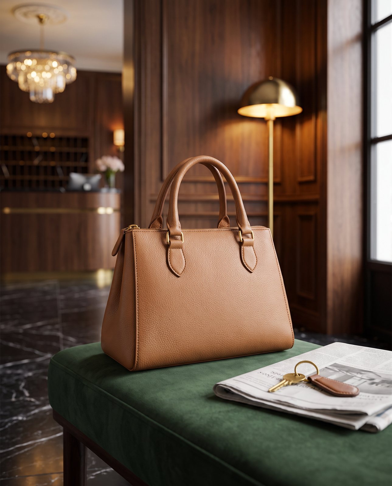
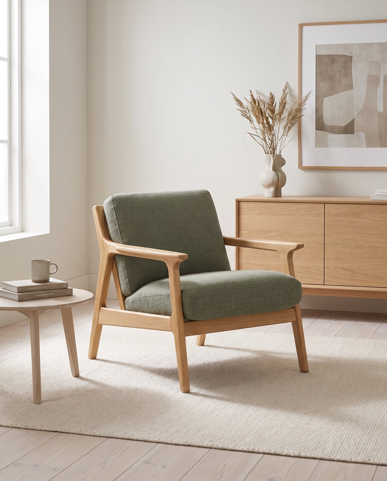
Here's the narrow job we do. We place your product into new scenes, in the shape you need: square 1:1, portrait 4:5, story 9:16 or wide 16:9. That means a whole collection can share one ratio, which is exactly what the grid wants.
You upload one to three photos of the product, on any background, as long as they're sharp and the whole product is in view. Before you pay, we study the photo and list every colour, shape and mark that must stay the same. That's free and takes about a minute. Then every shot is checked against the original. A shot that changes the product is remade with a specific fix, up to three attempts in all. If it's still wrong, a person checks it, and it is never delivered as is. You also get one free redo per delivered shot. A 3-shot order took about 4 minutes in testing.
On file data: in our 2 October 2026 demo run, portrait 4:5 shots came out as PNG files of 1,856 by 2,304 pixels, about 4.3 megapixels, roughly 4 to 8 MB each. That sits inside Shopify's limits.
Prices include VAT:
- 3 shots: £19 (£6.33 a shot)
- 5 shots: £29 (£5.80 a shot)
- 10 shots: £49 (£4.90 a shot)
- Custom, 11 to 40 shots: £4.50 a shot
Every shot is reimagined with AI and labelled as made with AI. We only work with products you own or sell; well-known brands' products can't be shot.
Now the limits, because they matter. We don't make plain white-background packshots. If that's what you need, the white background guide covers it. We don't resize or compress your existing images, so the checklist above is still yours to do. And we don't edit your theme, so the card ratio setting stays in your hands. What we make is lifestyle and campaign-style scenes; the lifestyle photos guide explains the thinking, and the examples show the output. If you're weighing options on a budget, cheap product photos compares routes, and changing a product photo's background covers the other approach. Full details are on the pricing page.