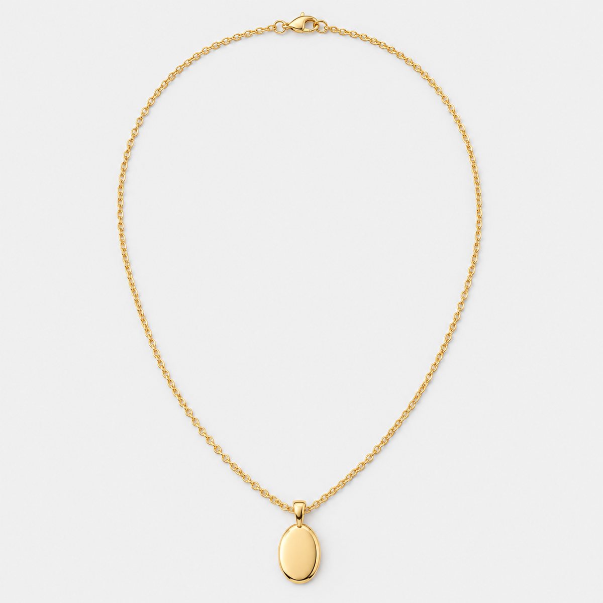
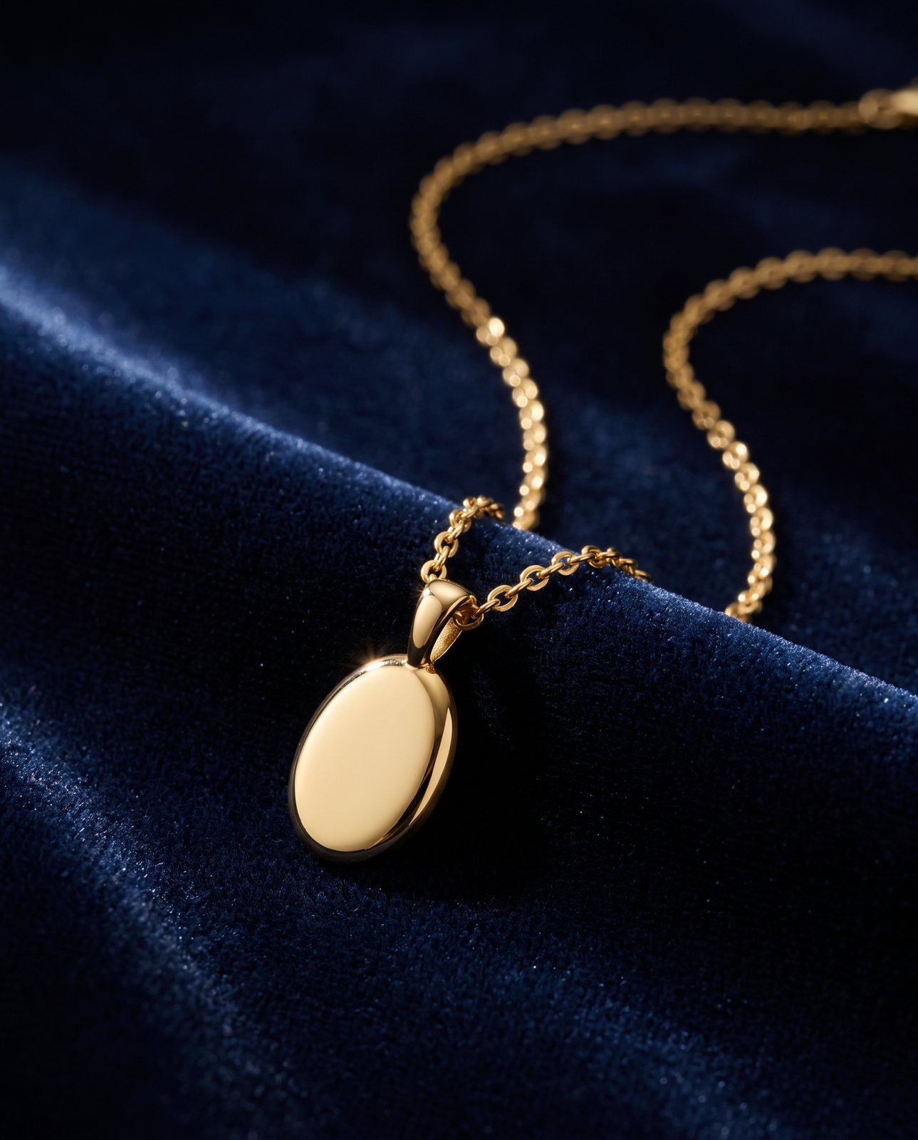
The short answer
Clean the piece. Hold it still. Light it with something big and soft, put white card around it so the reflections look clean, then shoot close with the focus on the one detail that sells it. Show scale with a hand or a simple prop, and you're most of the way there.
That's the whole recipe, and none of it needs fancy kit. What it needs is patience and a bit of fussing. Jewellery shows up sloppy set-ups, so the fussing is where the quality comes from. The rest of this page walks through each step, with the reasons behind it.
Why jewellery is hard to photograph
Anyone who has tried to photograph a glass bottle knows the feeling: you line up a decent shot, then spot your own face grinning back from the surface. Jewellery is that problem, shrunk down and made worse.
Start with size. A ring or an earring is tiny, so every flaw is magnified. A speck of dust that would vanish on a mug looks like a boulder on a polished band. A fingerprint on a pendant shows up like a streetlamp. And because you're working so close, the smallest shift of the piece or the camera turns a sharp frame into a soft one.
Then there's the reflecting. Metal and stones mirror whatever is around them. That includes the window, the ceiling, your jumper, the camera, your hands. Polished gold and silver are close to mirrors, and a cut stone bounces light in a dozen directions at once. So the shot you get depends less on the piece than on everything surrounding it.
And to be fair, it's fiddly in a purely physical way. Chains tangle. Rings roll. Earrings flop over. Pendants spin on their loops. You can spend ten minutes arranging one necklace and still find a kink in the frame.
None of this is a reason to give up. It's a reason to control the things you can control, one at a time. Cleanliness, stability and position come first, because if those are wrong, no amount of clever lighting will save the shot.
Clean, steady and in position
Clean first, and clean again. Dust and fingerprints are a common reason a jewellery photo looks cheap, and they're also the easiest thing to fix before you press the button. Wear thin gloves or handle each piece with a soft, lint-free cloth. Bare fingers leave oils that look dreadful on polished metal and glass-clear stones. Give the piece a gentle wipe, check it under a bright lamp, and wipe it once more. Then don't touch it with bare skin again.
Next, make it stay put. A piece that wobbles by a hair will blur at close range. For rings and small pieces, a small blob of putty or wax is the usual answer: a dab on a card or a stand, the ring pressed onto it, and it holds at whatever angle you like. Used sparingly, it's invisible in the frame, or easy to tuck out of sight. A proper jewellery stand or bust works too, and it's handy for necklaces that need to hang in a natural curve.
Think about how each type of piece sits best:
- Rings: prop them upright so you can see the face and the band, or lay them flat for a top-down view. Putty stops them rolling.
- Chains and necklaces: lay them out straight, with no twists and no hidden kinks. If the chain has a clasp, decide whether you want it in shot and place it deliberately.
- Earrings: pairs look best matched, so arrange them to mirror each other, either hanging from a stand or resting on a surface.
- Bracelets and bangles: stand them on their edge or lay them in a gentle curve. Watch the join and the clasp.
Then keep the camera still too. Put it on a tripod or any firm support, because holding it by hand at close range guarantees a little drift. If your phone or camera has a timer or a remote option, use it, so pressing the shutter doesn't nudge the frame. This sounds like a small thing. At this scale, it isn't.
Check the whole setup before you shoot. Is the piece straight? Is the chain flat? Is anything in the frame you didn't mean to include? It takes ten seconds, and it saves you reshooting an entire batch.
Light and reflections
Here's the rule that does most of the work: big, soft light. A small, harsh light source makes hard highlights and fierce glare on metal. A large, soft one wraps around the piece and gives smooth, gentle gradients. A window with a thin curtain works, so does a lamp shining through a diffuser, and so does a purpose-built light box. If you want the fuller picture, the lighting guide covers it, and the light box guide goes into the enclosed setup that suits small items so well.
Now for the clever bit: white card. Because polished metal mirrors its surroundings, the safest thing is to make the surroundings white. Stand sheets of white card or foam board around and above the piece, so that what the metal reflects is clean white rather than a messy room. A silver ring in a ring of white card shows smooth, bright reflections. The same ring in an untidy room shows clutter. Same ring, very different result.
Next, hunt for unwanted reflections. Move your eye to where the camera sits and look at the piece from there. Can you see the lens? Your hands? A bright window? Anything you can see will show up in the shot. Shift the card, move the light, or tilt the piece a few degrees until the reflections are the ones you want. Keep your own hands out of the setup once you've placed the piece, because they'll show in a mirror-bright surface.
Sometimes the opposite happens. Metal can look flat and dull when it's surrounded by too much white, with no contrast to show its shape. That's where black card comes in. A strip of black card placed to one side gives the metal a dark edge to reflect, and that line of darkness adds definition and depth. It's a small adjustment with a big effect. Try it with and without, and compare the two frames side by side. You'll see the difference straight away.
Gemstones behave differently again. They sparkle when light hits them from several angles, so a few soft sources, or a bit of movement in the light, can make stones come alive. Too much flat light and they go dull and glassy. Play with it. Take a few frames, shift the card, and see which one makes the stone look the way it does in your hand.
Close-ups and focus
Close-ups sell jewellery. People can't hold the piece, so they rely on the photo to show craft, texture and detail. That means shooting close, and it means focus matters enormously.
On supported models, a phone's macro mode lets you get remarkably near. If your phone has it, use it, and read the iPhone guide if that's what you shoot on. Otherwise, a camera with a macro-capable lens does the same job.
Keep your shot to the part that matters. If you're selling a ring with a lovely stone, fill the frame with the stone and the setting. If the clasp is the clever feature, show the clasp. You don't need the entire piece in every frame. A mix works best: one overall shot to show the shape, then closer frames for the detail. Each frame should have one job.
Focus is where close-ups go wrong. At this range the depth of field is razor-thin, so only a sliver of the piece is sharp. Pick the key detail (the stone's top facet, the engraving, the hallmark area) and focus precisely there. Then take several frames at slightly different focus points. One will usually be best, and having options beats having regrets.
Always check at full zoom. A photo that looks sharp on a small screen can be soft when you enlarge it. Zoom right in on the detail that matters and make sure it's crisp. If it isn't, reshoot. It's much easier to fix at the table than on the listing.
One more thing about shape. Getting very close with a short lens can distort proportions, making a ring look stretched or a pendant look oddly bulbous. A longer lens, or simply stepping back a little and cropping in later, keeps the shapes true. Jewellery should look like itself.
Backgrounds, scale and styling
Keep the background plain. A clean, simple backdrop lets the piece do the talking, and it keeps buyers focused where you want them. Neutral colours are a safe start: white, grey, soft cream. A contrasting colour can work well too, as long as it flatters the piece. Gold tends to glow against deep, dark tones, while silver and pale stones often look crisp on warm or mid-tone surfaces.
Texture adds interest without shouting. Velvet, a slab of stone: either one gives the piece something to sit on and a bit of character. Just be careful that the surface doesn't compete. Velvet can pick up lint and dust, so check it closely. Stone can reflect, so watch for glare.
Scale is the thing people forget. A small photo of a ring can make it look enormous, or a tiny earring can look like a statement piece. Buyers want to know the real size. A hand is the simplest answer: a finger wearing the ring, a wrist wearing the bracelet. If you'd rather keep it model-free, a familiar object does the same job. A coin, a pencil tip, a sewing needle, whatever your customers will instantly recognise. Make the comparison obvious without making it the star.
That leads to props. A sprig of dried flowers or a ribbon can add mood, but the piece must outshine everything near it. If your eye goes to the prop first, take the prop away. At the end of the day, the jewellery is what's for sale.
Last, keep colour true. Gold, rose gold and gemstones are all sensitive to the light and the backdrop around them. A warm backdrop can push silver towards yellow. A blue-ish light can make gold look greenish. Check your photo against the piece in your hand, in daylight if you can. If the colours don't match, adjust your light or your white balance until they do. Buyers will forgive a lot, but they won't forgive a ring that arrives looking different from the picture.
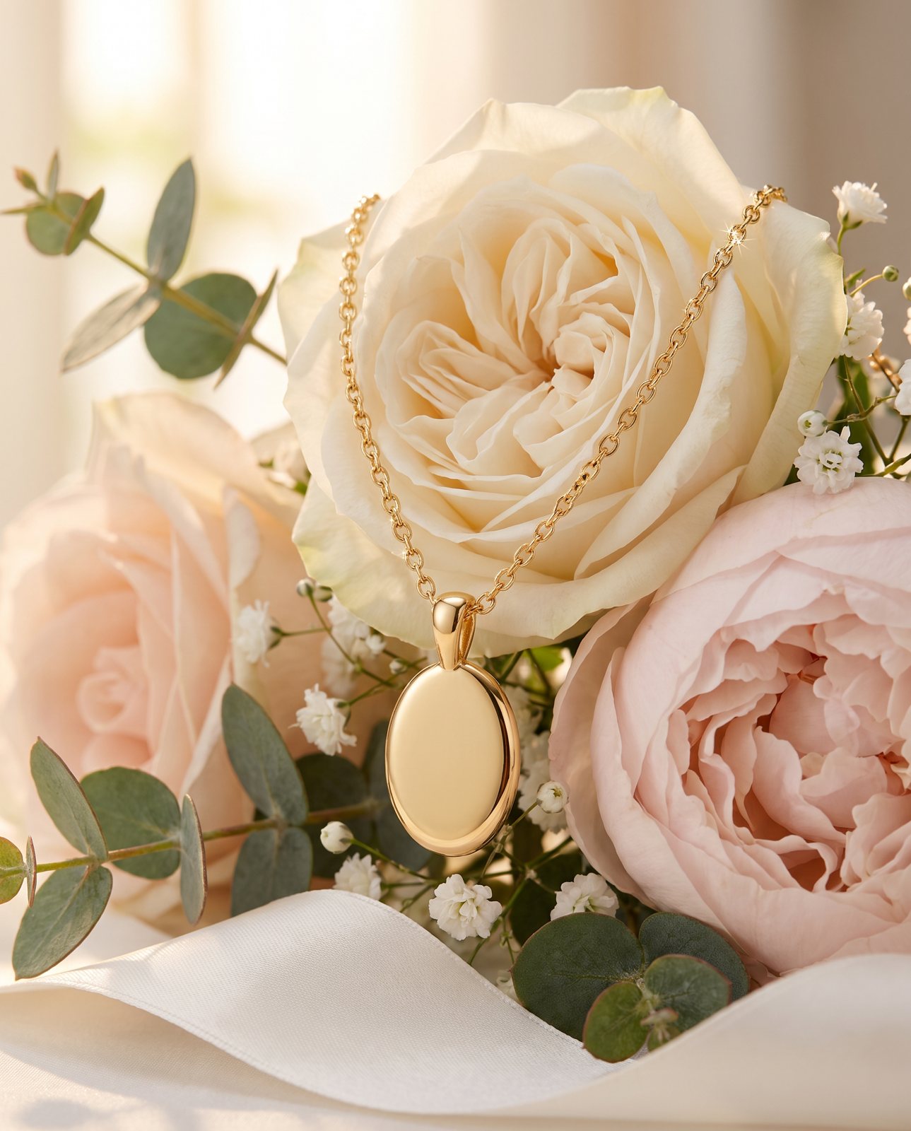
A lifestyle scene for the same pendant, made from the one photo above.
How Product Photo Shots helps (and what it doesn't do)
Honest version, because it's the useful one. Product Photo Shots takes a photo of your product and puts it into new scenes. It doesn't replace the careful work above. You still need a clean, well-lit, sharp original, because everything starts from that.
Here's what we saw. In our demo run on 2026-10-02, we took 10 products (including a necklace) across 3 scenes each: 30 shots in all. Of those, 27 were delivered and 3 were held back by the check. A gold pendant necklace was delivered in all three of its scenes, although one first attempt was remade after the check. Shiny metal in general is where AI scenes slip. We saw brushed steel picking up its surroundings, and two steel bottle scenes failed all three attempts and were never delivered. We also saw colour drift on a coral skincare jar and on amber perfume, with one perfume attempt rejected as "colour wrong". So the check matters, and every result is compared with your original.
Here's how that check works. Before payment, we study the photo and list what must stay the same. It's free and takes about a minute. If a shot changes the product, it's remade with a specific fix, up to three attempts in all. If it's still wrong, a person checks it, and it is never delivered as is. You also get one free redo per delivered shot. Shots come in square 1:1, portrait 4:5, story 9:16 and wide 16:9. Every shot is reimagined with AI and labelled, and the files carry standard AI-provenance metadata.
What we don't do matters just as much. We don't make macro close-ups of stones or hallmarks, so those detail shots still have to come from your own careful photography. And we don't remove dust from a photo, so clean the piece first. If you want to see what a new setting might look like, you can put the product in a new scene.
On cost, packs run 3 shots for £19 (£6.33 a shot), 5 shots for £29 (£5.80), and 10 shots for £49 (£4.90). A custom pack of 11 to 40 shots is £4.50 a shot. Prices include VAT.