The short answer
Fill the pouch or prop it up so it stands and holds its shape, smooth out the creases with your hand, light it with soft side light, keep the label square to the camera and readable, and style the scene with the real ingredient. That's it. Everything else on this page is just the detail behind those five things.
I mean, you can do all of it at a kitchen table with a window and a bit of white card. The pack is the hero, so make it look fresh, full and honest, and let the beans or the flour or the tea do the supporting work around it.
Why packaging photos go wrong
Pouches look easy to photograph and are quietly awkward. You put a bag on a table. How hard can it be? Quite hard, actually.
The first problem is slump. An empty or half-empty pouch folds over at the shoulders, the top flops forward and the whole thing looks like it's tired. Nobody wants to buy coffee from a bag that looks tired. A pouch that sags says "old stock" before anyone has read a word of the label.
Then there are the creases. Every fold in a pouch is a tiny mirror, and when the light hits it from the wrong angle you get a bright white streak right across the brand name. You don't notice it while you're shooting (you're busy looking at the bag, the streak just isn't on your radar), but it jumps out the moment you see the photo on a screen. Foil pouches are especially prone to this, though even a paper-look bag will catch light on a crinkle.
Finishes are another trap. A foil or glossy pouch reflects the room, the window and your own arm, while a matte one soaks the light up and shows its colour more plainly. The same bag can look like two completely different products depending on which finish you've got and where the light is coming from. So you can't just copy a lighting setup from a mug or a bottle and expect it to work.
Labels warp too. A label that looks perfectly flat in your hand curves around the belly of a filled pouch, and the text at the edges stretches and tilts. Photograph it from slightly the wrong height and the logo leans, the lettering shrinks on one side, and the whole front looks wonky.
And colour shifts. Burgundy goes brown under a warm lamp, a cream label goes yellow, a bright green goes muddy. Customers compare what arrives against what they saw, so if the photo is off, you're setting yourself up for "it wasn't the colour in the picture" messages.
The last thing is the one that sits underneath all of it: food and packaging have to look fresh and honest. People are about to put this in their mouths. A grubby, crumpled, badly lit pack makes them wonder what's inside, and a slightly fussy, over-styled scene can make them wonder what you're hiding. Clean, clear and truthful is the aim.
Standing the pack up and smoothing creases
Start with the pack itself, before you go anywhere near a light.
The easiest way to get a pouch to stand is to fill it. If you've got the real product, use it: put the actual coffee or granola or tea in, so the bag has the weight and the shape it'll have when a customer opens the parcel. If you don't have enough to fill it, use a weight instead, something clean and flat in the bottom that you can push right down into the base. A bag of rice will do, or any small sealed packet, and a bit of rolled-up paper if that's all you've got. The point is to give the bottom some body so the bag has a solid foot to stand on.
Once it's standing, tidy the corners. Pouches tend to have two bottom corners that tuck in or flare out unevenly, and if you leave them messy the pack looks like it's leaning even when it's straight. Push each corner into a neat, matching shape. Then check the shoulders, where the front and back panels meet the top. This is where most slump happens, so gently square them off with your fingers.
Now the creases. Run your hand down the front of the pack, flat, from top to bottom, and press the air towards the sides. You're not trying to iron it like a shirt; you just want to calm the big folds. A few tiny wrinkles are fine and look natural, but a deep crease straight through the logo is going to catch the light and ruin the shot. If one persists, try pushing a little more filling into that area from behind, or turn the pack a few degrees until the worst fold sits at the side where it doesn't matter.
To hold it steady, lean it against something out of frame. A piece of stiff card behind it works well, or a small support (a book, a box, a block of wood) pushed up against the back so the pack can't tip forward. Keep that support right out of the picture; if you can see it, you've gone too far or your camera is too wide. A bit of tape on the card can help hold a pouch upright if it's being stubborn, though tidy any tape marks before they show.
Finally, look at the top. The seal, the tear notch and the zip are the details that tell a customer this is a proper, well-made pack. Make sure the top seal is straight and not crumpled, and that a resealable zip is closed and sitting evenly across. A zip that's gone wavy or a seal that's folded over looks careless, and it's an easy fix before you take the photo, not after.
If you want the wider picture on how to organise your space and camera before you start, the setup guide covers it.
Light, labels and colour
For light, think big and soft. A large, soft source coming from the side is what most pouches want. A window works beautifully, especially if you can put a sheet or a bit of thin white fabric over it to spread the light out. Put the pack on a table beside the window so the light rakes across it from one side rather than hitting it straight on.
Now put a piece of white card on the opposite side, just out of frame. It bounces a little of that window light back into the shadow side of the pack, so the dark side isn't muddy and black. Move the card closer and the shadow gets lighter; move it away and you get more shape and depth. It's a very cheap trick and it does a lot.
The label is where you need to be most careful. Keep the front of the pack flat to the camera, so the label faces the lens squarely, not tilted up, down or round to one side. If your camera is too high you'll get a pack that looks like it's falling away from you, and if it's too low the top looks huge and the base shrinks. Aim to have the lens about level with the middle of the label. Then check it at full zoom on your screen. If you can't read the smallest line of text when you zoom right in, a buyer won't be able to either, so move the light, nudge the angle or smooth the crease until you can.
A matte pouch is much easier than a glossy one, and if you've got a choice of finish it's worth knowing that. Matte holds its colour and forgives a bit of sloppy lighting. A glossy or foil pouch picks up every reflection, so you'll need softer light, a bit more care with angles, and sometimes a slight tilt of the pack to move a stray highlight off the label. Don't fight it for hours; just shift things in small steps and keep checking.
Colour matters more than people expect. Brand colours are the thing customers remember. So hold the real pack next to your screen, ideally in daylight by the window, and compare. Is the burgundy the same burgundy? Is the cream label cream, or has it gone yellow? If the photo looks warmer or cooler than the real thing, that's your light talking. Avoid warm household lamps while you shoot, because they push everything towards orange and are very hard to correct later. Daylight, or a clean, neutral light, keeps the colours honest.
There's more on getting the light right in the lighting guide, including how to deal with reflections on shiny surfaces.
Styling with beans, ingredients and props
Once the pack looks right on its own, you can build a scene around it. This is the fun bit, and also where it's easiest to overdo things, so I'd say go gently.
The best props are the real ingredient. For coffee, scatter a few real beans around the base of the pack. For a granola pouch, a small spill of oats and nuts. For a tea bag, a few loose leaves and a cup. Don't use too many, though; a handful is plenty. If the beans start climbing the pack or covering the bottom of the label, you've gone too far. They should look like they've fallen there naturally, not like a landslide.
Beyond the ingredient, one or two supporting props is usually enough. A scoop makes sense for coffee, a cup or mug tells a story about how it's used, and a wooden spoon or a small bowl works for food. Think about what a customer would picture doing with the product, then put in just enough to suggest it.
The surface and background set the mood. A wooden counter feels warm and a bit craft. A rustic kitchen, with a bit of soft clutter blurred behind, feels homely and honest. A dark, moody backdrop suits a premium roast, because it makes the pack glow and gives the whole picture a quiet, serious feel. Match the scene to the brand: a cheerful family brand probably wants light and warm, a small-batch specialty roaster might want something darker and more dramatic.
Whatever you pick, the pack stays the brightest and sharpest thing in the picture. If your eye goes to the cup or the beans first, rebalance it: pull the props back, soften them, or add a touch more light on the pack. The scene is there to support the product, never to compete with it.
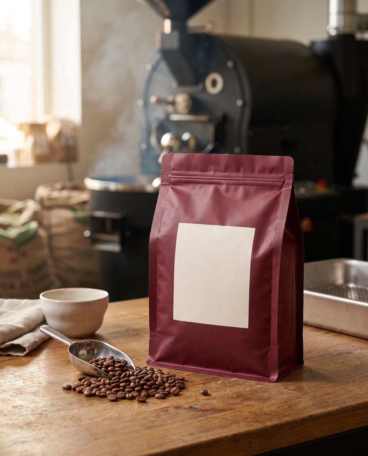
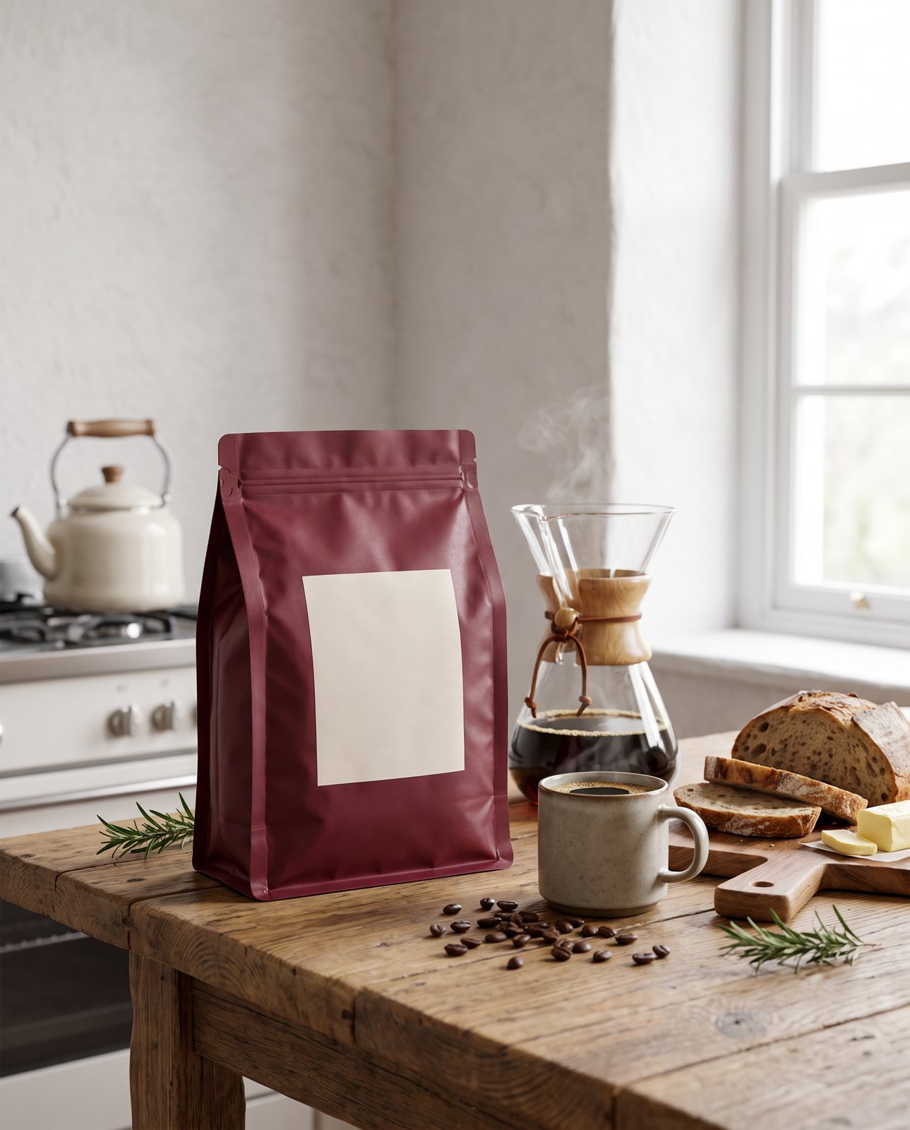
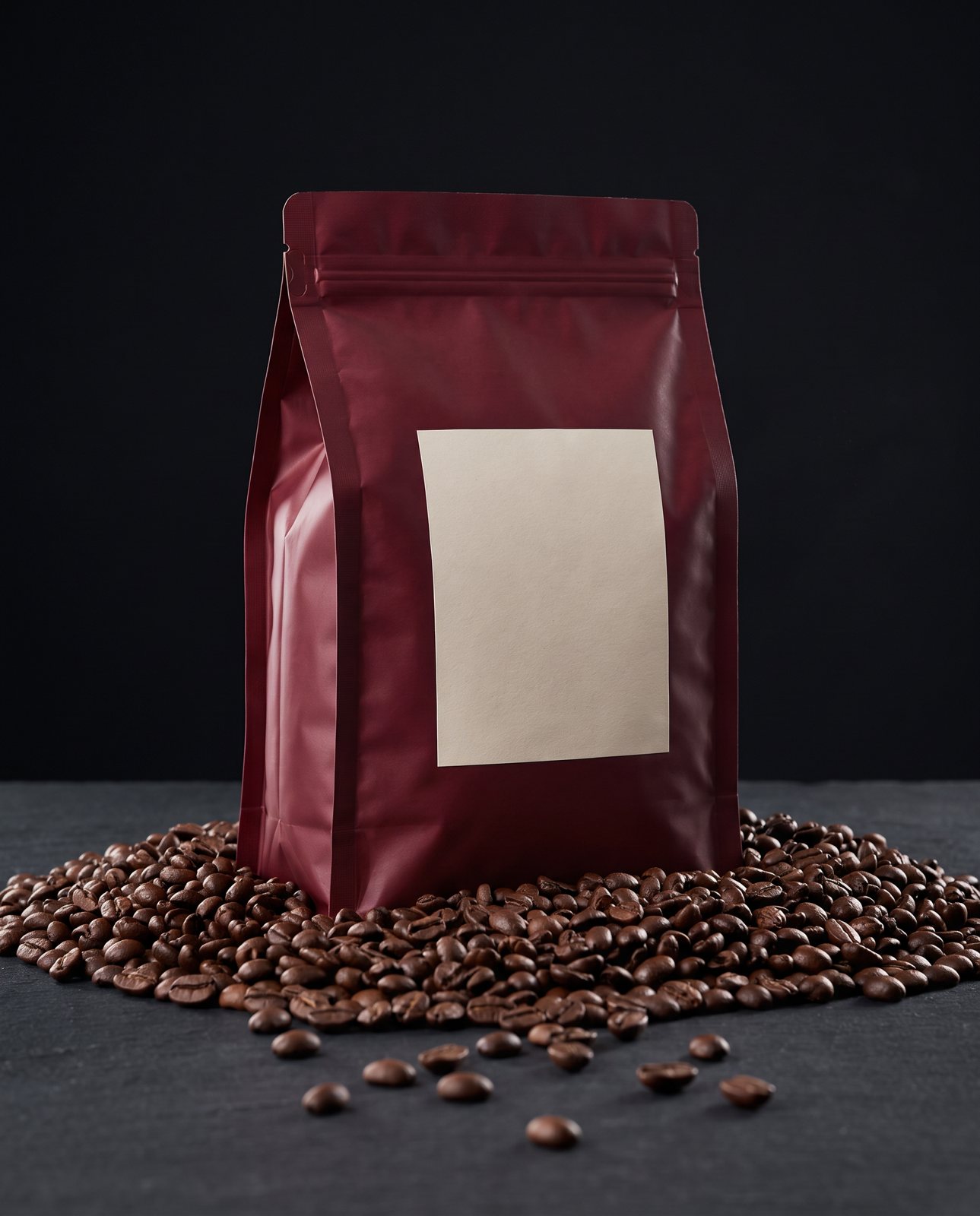
For a coffee pouch, the three scenes in our own demo are a roastery counter, a rustic kitchen and a dramatic studio surrounded by beans. They're a handy starting point if you're stuck for ideas, because between them they cover warm and practical, homely and cosy, and dark and premium.
One more thing, and it matters. The rules for what has to appear on a food pack, and anything legal about the labelling, are the seller's responsibility. Whatever your photos show, the pack itself has to be right, and that's down to you, not the picture.
How Product Photo Shots helps (and what it doesn't do)
Let me be straight about what we do, because with packaging it matters.
We start from your one photo of the pack and put it into new scenes. One good photo of the real product is the starting point. If you want to understand what that looks like in practice, there's more in our piece on lifestyle product photos.
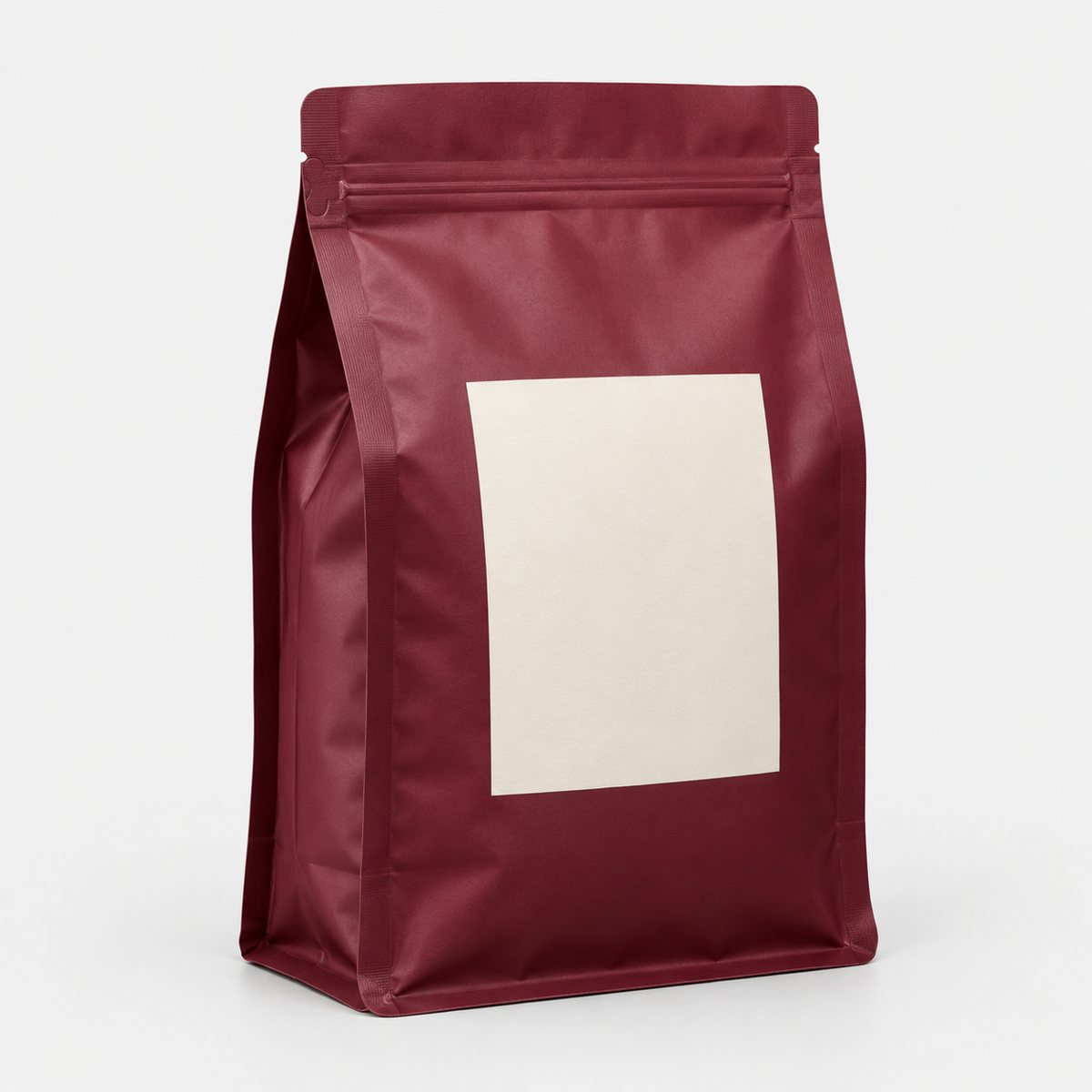
In our demo run, a burgundy resealable coffee pouch with a blank cream label was delivered in all three scenes: the roastery counter, the rustic kitchen and the dramatic studio surrounded by beans. Across the whole demo set we shot 10 products in 3 scenes each, so 30 shots, and 27 were delivered while 3 were held back by our check.
Labels are the risk, and I'd rather say so than gloss over it. In a separate test using a famous brand's product, small printed text (a tongue label on a trainer) came out garbled on most shots, though logos and large text held. That's why we compare every result with your original. If the small print on your pack matters, check it closely in every image.
Before you pay, we study your photo and list what must stay the same. That check is free and takes about a minute. If a shot changes the product, it's remade with a specific fix, up to three attempts in all, and if it's still wrong a person checks it. It is never delivered as is. You also get one free redo per delivered shot.
Every shot is reimagined with AI and labelled as such, and the files carry standard AI-provenance metadata, so nothing is hidden.
On pricing: 3 shots are $26 ($8.67 a shot), 5 shots are $40 ($8 a shot) and 10 shots are $67 ($6.70 a shot). A custom order of 11 to 40 shots is $6.10 a shot. Prices in US dollars, before any sales tax.
Now what we don't do. We don't photograph the real pack; we work from the photo you give us. We don't make or fix legal labelling, so anything required on a food pack stays with you. And we can't shoot well-known brands' products, because the image services refuse them; we tell customers that before they pay, and it only covers products you own or sell.