The short answer
Use one big soft light from the side, white and black card to shape the reflections, a clean bottle on a simple surface, and the camera on a support. Then check that the liquid looks the colour it really is. That's honestly most of it.
The rest is patience. You'll move a piece of card a few centimetres, wipe a fingerprint, turn the bottle a touch, and shoot again. Perfume rewards that sort of fiddling, so settle in and expect a handful of frames before you get one you like.
Why perfume bottles are hard to photograph
Clear glass shows everything behind and around it. Everything. The window, the lamp, your jumper, the messy shelf you forgot was there. A bottle is basically a small, curved, slightly bossy mirror, and it will reflect whatever you let into the room.
The liquid is the next problem. It changes colour with the light and with whatever sits behind it, so a pale gold scent can go orange under a warm lamp and nearly vanish against a white sheet. I mean, you've probably seen listings where the perfume looks like weak tea. Not great.
Then there are the flat faces. A rectangular bottle has big flat sides, and flat sides mirror the room in one hard, bright patch instead of a soft gradient. A metal cap flares too, throwing a white hotspot that hides the detail on it. And fingerprints and dust, which you'd never notice in person, show up like neon signs once the camera gets close.
Here's the thing to hold on to through all of it. The photo needs to look like the bottle on the shelf. No dramatic version, no cleverer one, just the same glass, the same colour, the same cap and printing. Buyers can't pick it up, so the picture has to do the picking up for them.
Controlling reflections in glass and metal
Start with the light. You want one large, soft source to one side of the bottle. A window with a diffuser over it works well (a bit of thin white fabric or tracing paper will do), or you can bounce a lamp into a big sheet of white card so the light arrives wide and gentle rather than as a hard point. The bigger the source compared with the bottle, the softer and smoother the reflection looks.
Next, white card. Stand a sheet just out of frame on the side opposite your light, or beside the bottle, and it gives the glass clean, bright edges. Those pale edges are what make a glass bottle look like glass instead of a smudgy shape. Move the card closer and the edge gets brighter; move it back and it fades. Play with it.
Black card does the opposite job, and it matters just as much. Put a piece beside the bottle, out of shot, and it keeps the edges defined, giving you a crisp dark line where the glass ends and the background begins. Without it, a clear bottle on a pale backdrop can melt into the background and look strangely flat. White card for glow, black card for outline. Between them you're sculpting the bottle with reflections, which is the whole trick.
Keep yourself out of it. It's worth stressing, because it catches a lot of people. Stand where you like, but look at the bottle's flat faces and the cap before you press the shutter: if you can see a tiny you holding a camera, or the dark blob of the camera itself, move. A clean way round it is to shoot from slightly to one side, or to put a black card with a hole cut for the lens in front of you. Fiddly, but it works.
Then there's the smallest fix of the lot. Rotate the bottle slightly. A few degrees is often enough to slide an ugly reflection off a face and onto an edge, where it looks deliberate. Tilting the camera a touch does a similar thing. If a hotspot is sitting on the cap, nudge the bottle, don't reach for the lamp. The same goes for brushed metal, which tends to pick up its surroundings and show a smeared version of the room, so a bit of rotation and a bit of card around the cap usually calms it.
If you want a deeper walk through setting the light itself, the lighting guide covers it step by step.
Showing the liquid and the label
Liquid looks best when light goes through it. If you put a source behind the bottle, or set the bottle in front of a pale backdrop that's lit from behind, the scent glows, and that glow is what makes perfume look like perfume. A flat front light leaves the liquid looking dull and a bit muddy. So try a little light from behind, then bring your side light back in to keep the front readable.
Colour is where people slip up. The backdrop tints the liquid, and so does a warm lamp, so a pale champagne can drift towards orange without you noticing, because your eye adjusts and the camera doesn't. The check is simple: hold the real bottle up in daylight, look at the liquid, then compare it with the photo on your screen. If the picture is warmer, deeper or greyer than the bottle in your hand, change the light or the backdrop and go again. I know, it's tedious. It's also the check that matters most.
The label wants the same care. Keep it, and any printing on the glass or box, square to the camera so the lettering reads cleanly and the lines don't lean. A bottle turned even slightly off can make a name look like it's sliding downhill. Check the text is sharp and nothing's cutting across it, such as a reflection or a bright stripe from your card.
And wipe it. Before every frame, honestly, a microfibre cloth and a quick look. Fingerprints are almost invisible until the light hits them, then they're all you can see. Dust too. I'd rather wipe ten times than retouch one smudge.
Backdrops, surfaces and scenes
Keep the backdrop plain to start with. A pale one feels fresh and clean; a dark one feels rich and a bit moody. As a rough rule, dark backdrops suit rich, heavy scents, and light ones suit fresh, airy ones. It also follows the old contrast idea: a light bottle or pale liquid pops against a mid or dark background, while a dark bottle reads better on a light one.
The surface matters nearly as much as the backdrop. A piece of stone gives weight and calm. Wood gives warmth. Either is easy to find, and both ground the bottle so it doesn't look like it's floating. If you want a reflection under the bottle, a mirror or a sheet of glossy card does the job, though it doubles the cleaning, since every speck shows twice.
Props are tempting. A few flowers or a slice of citrus can suggest a scent without a word, and a fold of fabric does the job too. But keep them small, and keep them few. The bottle is the hero, and if your eye goes to the lemon first, the lemon has won.
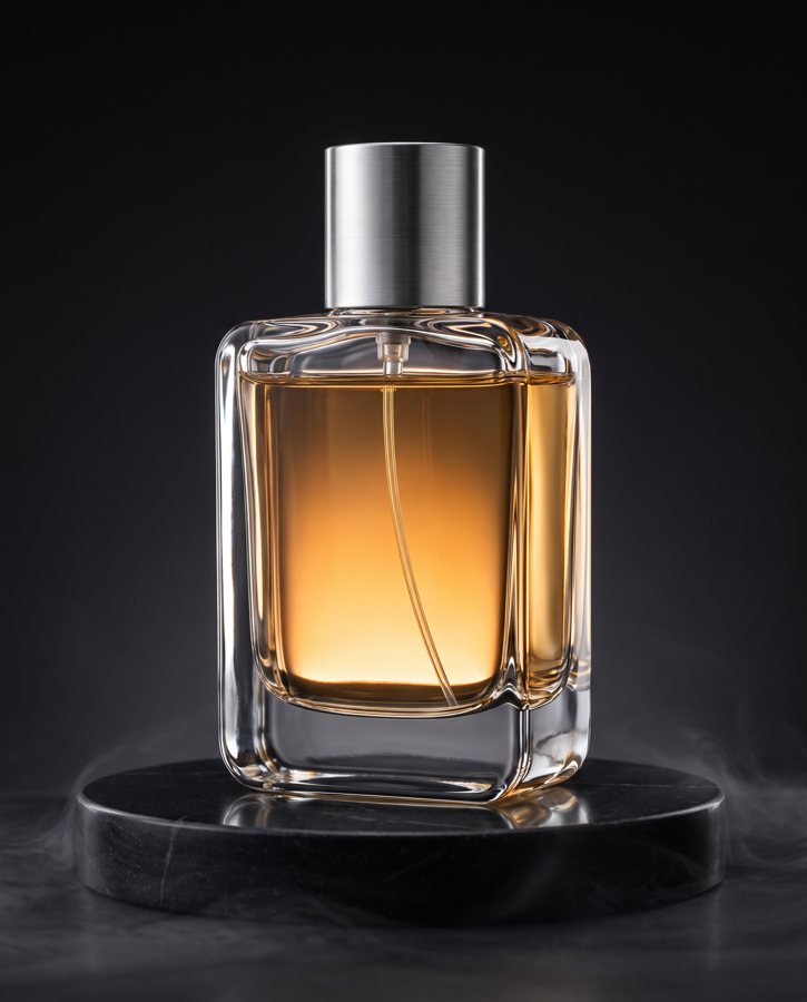
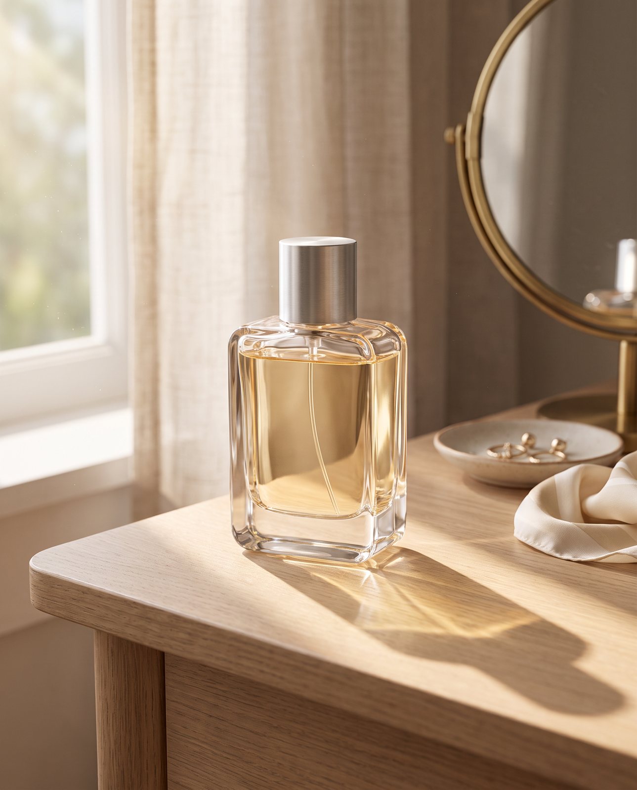
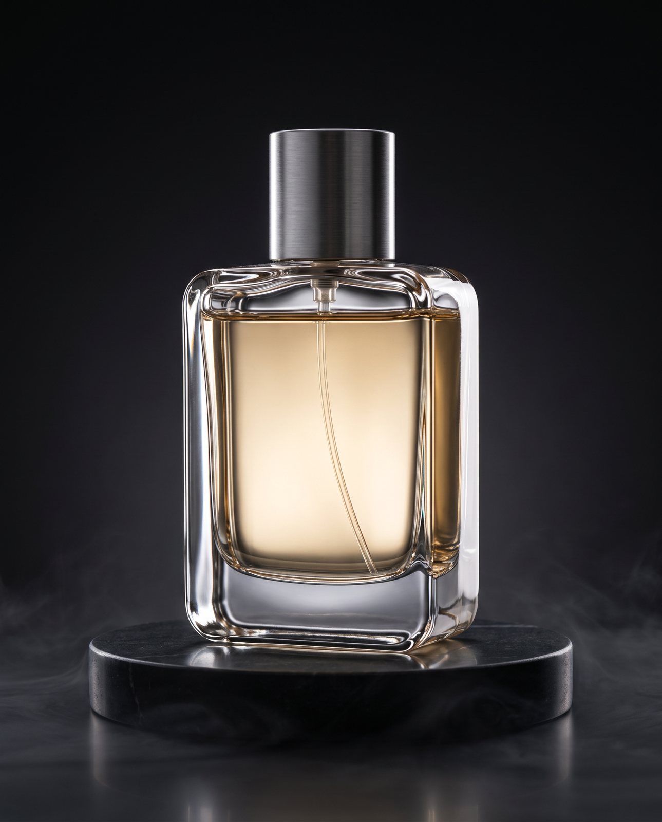
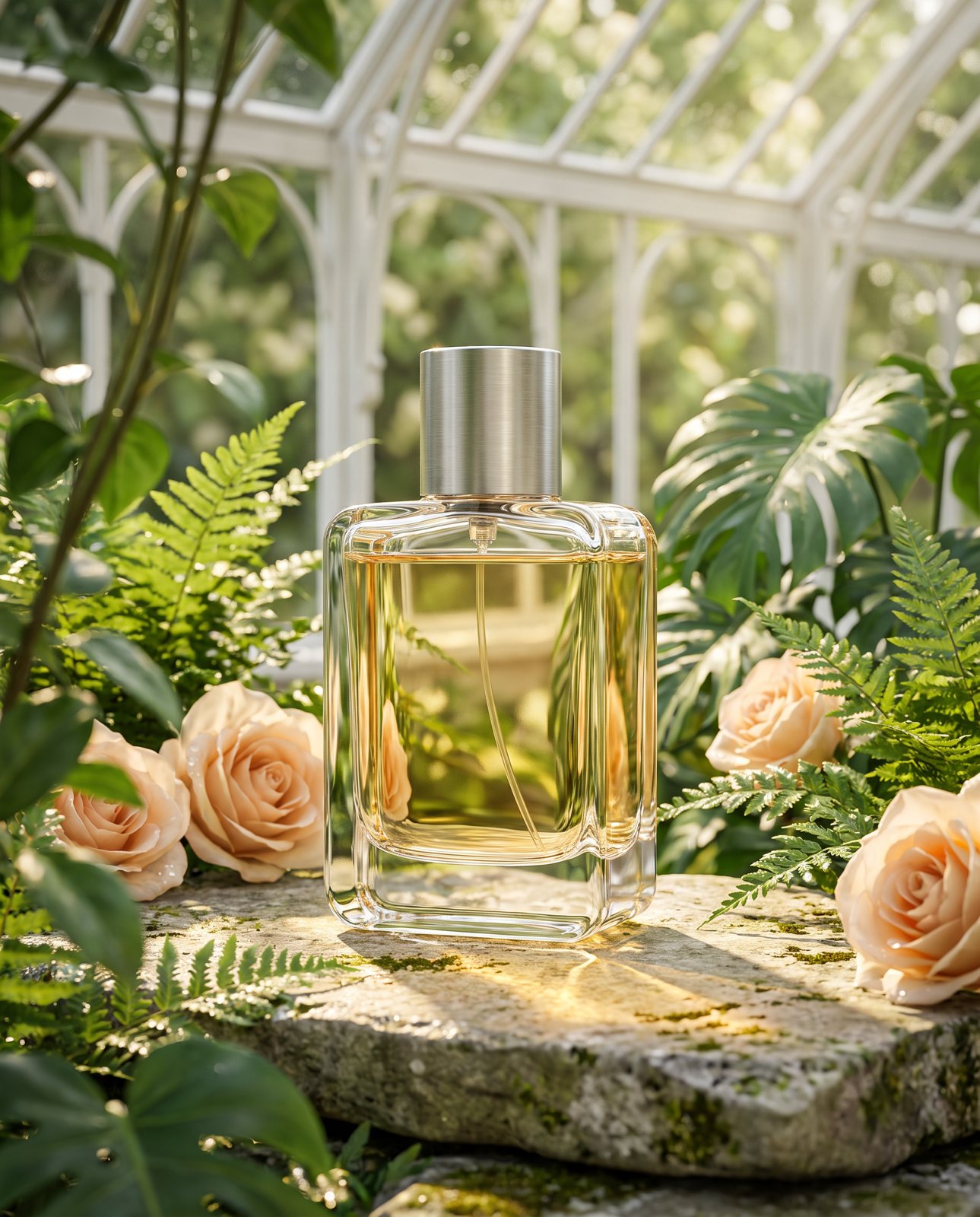
If you want ideas for what a finished scene can look like, our demo used three: a sunlit dressing table, a dark stone podium and a botanical garden. They show the same bottle can feel soft and homely, dramatic and polished, or green and fresh, just by changing what's around it.
Angles and the shots a listing needs
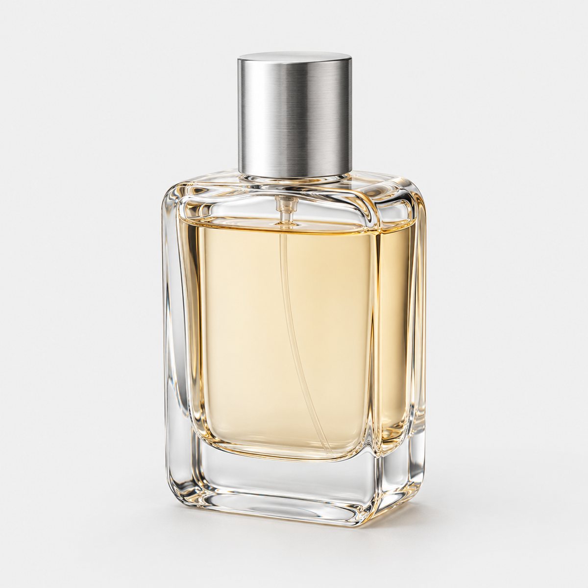
Begin with a straight-on front view. It's the workhorse shot, the one that shows the bottle as it is, with the label square and the shape clear. Get that right and you've got your main image.
Then a slight three-quarter view, turned just enough to show the side and give the bottle some depth. Not a big swing; a small turn is plenty. After that, a close-up of the cap and neck, because buyers want to see the finish and the detail up there. Watch that cap for flare, since it's the part most likely to throw a hotspot.
Add a shot of the bottle with its box if you have one, which tells people what turns up at their door. And a scale shot with a hand, because it's surprisingly hard to guess how big a bottle is from a photo, and a hand fixes that in a second. A tidy, clean hand, mind you, with no rings catching the light.
Whatever you shoot, keep the crop and the light consistent across the range. If you sell several scents, the bottles should look like a family, shot from the same distance and framing, with the light coming from one direction. It makes a shop look careful, and it makes comparing scents easy. There's more on building a full set in our guide to ecommerce product photography.
How Product Photo Shots helps (and what it doesn't do)
Let me be straight about what we do. We start from your one photo of the bottle and place it in new scenes. That's it. We don't photograph the real bottle on your desk, and we don't do macro close-ups of printing, so if you need a razor-sharp shot of tiny lettering, that's one for your own camera.
Perfume is a hard case for AI, and I'd rather say so than pretend. In our demo run, a clear rectangular glass bottle with pale champagne liquid and a brushed silver cap was delivered in all three scenes. But one first attempt, on the dark stone podium, turned the liquid deep amber. It was rejected as colour wrong and remade. That's exactly why every result is compared with the original: the check exists because this sort of drift happens.
Here's how the checking works. Before you pay, we study your photo and list what must stay the same. It's free and takes about a minute (our precheck measured at 11 seconds on 2026-10-01). If a shot changes the product, it's remade with a specific fix, up to three attempts in all. If it's still wrong, a person checks it, and it's never delivered as is. You also get one free redo per delivered shot.
We should say plainly where it struggles. The same demo run covered 10 products across three scenes each, so 30 shots, and 27 were delivered while 3 were held back by the check. Amber perfume and a coral skincare jar both showed colour drift, and brushed steel picking up its surroundings caused trouble too: two steel bottle scenes failed all three attempts and were never delivered. So reflective metal and tricky liquid colours are the things to expect extra care with.
A few other honest points. Every shot is reimagined with AI and labelled, and the files carry standard AI-provenance metadata. We only shoot products you own or sell; well-known brands' bottles can't be done, because image services refuse them, and you're told before you pay.
Pricing is simple, in US dollars, before any sales tax: 3 shots for $26 ($8.67 a shot), 5 shots for $40 ($8), 10 shots for $67 ($6.70), or a custom run of 11 to 40 shots at $6.10 a shot. If you want the wider picture of how this sort of thing works, our guide to AI product photography goes through it.