The short answer
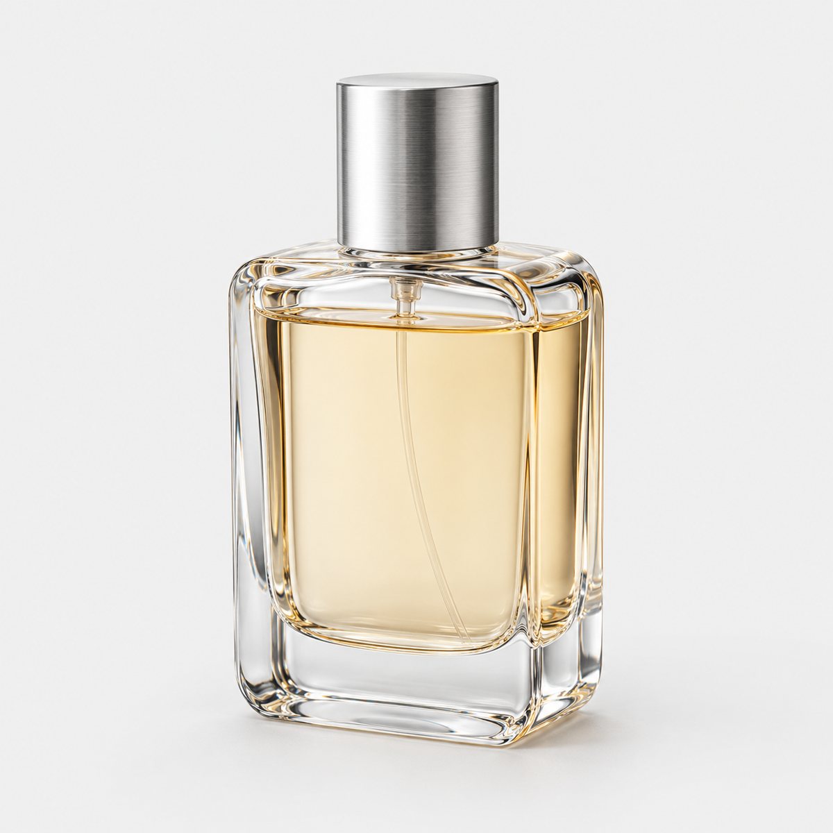
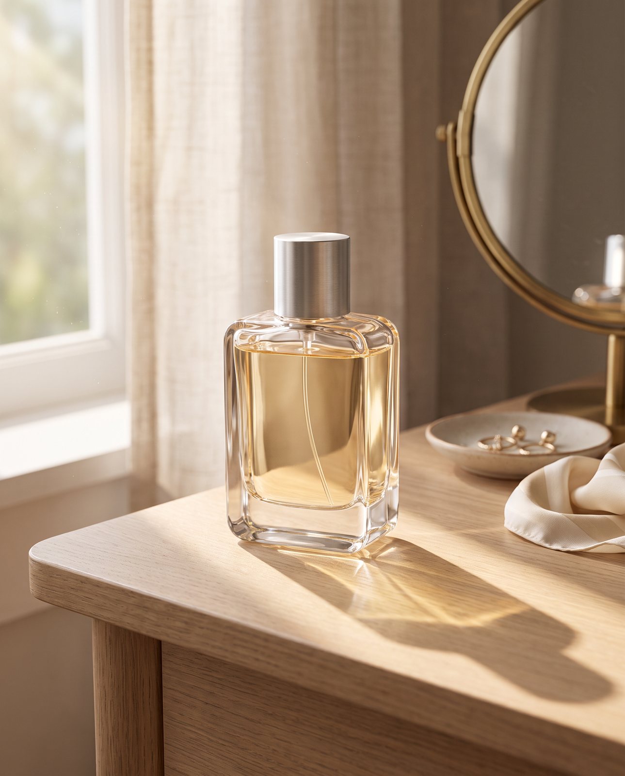
Start with a sharp, evenly lit photo of the whole product. Then write a prompt that describes the product exactly, says what must not change, and only after that describes the scene: the light direction, the camera angle and the scale.
Then check every result against the original photo. Reject any image where the product has changed. Don't retouch it, don't hope; reject it and go again.
What an AI background tool does to your photo
"AI background" covers two different jobs, and they fail in different ways.
The first is background replacement on a cut-out. The tool separates your product from its surroundings, keeps those pixels exactly as shot, and puts something new behind them. The new background is either chosen from a library or generated. Photoshop works this way. Its Select Subject and Remove Background are AI selections that don't use generative credits, while Generative Fill, which makes a new background from a text prompt, does use them. Your product stays your product. Fair enough.
The catch: cut-outs can look pasted on. The light on the product was the light of your table, and the new scene has its own light. They rarely agree.
The second is full scene generation. Here the whole picture, product included, is redrawn. General AI chat tools such as ChatGPT and Gemini can restage a product this way. The result often looks natural, because the product and the scene were drawn together. But the product was redrawn too, so labels, logos and colours can change, and there's no built-in check against your original.
So that's the trade. Cut-outs keep the product but can look pasted on. Full generation looks natural but can change the product. Neither is wrong; you just need to know which risk you're taking. If you want every option side by side, see every way to change a product photo's background. This page stays on getting a good result from the AI route.
Start with a photo the AI can work from
A weak source photo caps your result. No prompt rescues a blurry, half-cropped, orange-tinted original.
Here's what the source needs:
- Sharp focus across the whole product.
- The entire product in frame, with a little room around it.
- A plain background, so the tool has no confusion about where the product ends.
- Soft, even light, without harsh hotspots or deep shadows.
- No colour cast. If your white shelf looks yellow, your product will be wrong from the start.
- Any label or printed text readable at full size.
One more thing, and people skip it. Shoot the angle you want in the final scene. The AI keeps the viewpoint. If you photograph a bottle from above and then ask for a shot at eye level on a kitchen counter, you'll get a strained, tilted compromise. Decide where the camera sits in the finished image and shoot that.
You don't need a studio. A phone and a window will do, and there's a walkthrough if you'd like it: take a sharp product photo on your iPhone.
Describe the scene: a prompt pattern that protects the product
A common cause of a bad AI background is a prompt that starts with the scene. "A cosy kitchen with morning light" tells the tool nothing about the thing you're selling, so it fills the gaps itself. That's where the changed colours and invented details come from.
Flip the order. Here's a pattern you can reuse for any product:
- What the product is: exact colour, material, finish and any text on it.
- What must stay the same, spelled out.
- The surface it stands on.
- The setting.
- Light direction and softness, matching the original photo.
- Camera angle and framing, matching the original.
- Scale cues.
- Mood, last.
Mood goes last because it's the vaguest instruction, and vague instructions are where the tool gets creative. Say it once the product is pinned down.
Here's a worked example for a cobalt blue glazed mug with a slightly handmade shape:
"A cobalt blue glazed ceramic mug with a glossy finish, a slightly uneven handmade shape and a rounded handle, no text or logo. Keep the mug exactly as in the photo: same cobalt blue, same glaze, same irregular shape, nothing added or removed. It stands on a pale oak table. The setting is a quiet kitchen corner with a window to the left. Soft daylight from the left, gentle shadows falling to the right, matching the original photo. Camera at the same slightly raised angle as the photo, mug centred with space around it. A folded linen cloth and a small plant sit behind and to the side, both clearly smaller than the mug. Calm, warm, unhurried."
Notice what's doing the work. The colour is named. The handmade shape is named as something to keep, not left to be "fixed". The light direction is stated rather than implied.
Two cautions. First, avoid scenes whose light fights the original. If your photo was lit from the left, don't ask for a sunset beach where the sun sits on the right. The tool may ignore you, or produce a product lit from two directions at once. Second, keep props smaller than the product and away from it. A big prop beside a small product shrinks the product visually; a prop touching it invites the tool to blend the two.
And be honest with yourself about one line. Writing "keep the product the same" is a request. Nothing sits behind it, no check, no enforcement. The tool may comply, may mostly comply, or may quietly change a shade. The prompt lowers your risk. It doesn't remove it. That's why the check at the end matters.
Light, shadow and scale: what makes it look professional
When a product shot reads as fake, it's often one of five things.
Start with the contact shadow. Where the product meets the surface there should be a small, dark, soft shadow, tight to the base. Without it, the product floats. Cut-outs are the worst offenders here.
Then the direction. Shadows should fall away from the scene's light. If the window is on the left, shadows go right. A product with a shadow pointing at the window is an instant tell, even for people who couldn't explain why.
Glossy products add a reflection problem. A glazed mug, a polished bottle or a glass jar picks up its room. If the reflections show a studio softbox while the scene is a sunny garden, the eye catches it. Reflections should match the new room.
Next, colour temperature. Warm morning light on the scene and cool, bluish light on the product won't sit together. Match them, or ask for the scene to match the photo, which is why step five of the prompt exists.
Finally, scale. Props give the viewer a size reference, and they have to be believable. A mug beside a lemon should look mug-sized. If the lemon looks like a pumpkin, the mug has become a thimble.
Then run the thumbnail test. Shrink the image to the size it will appear in a search result or a grid. Does the product look planted in the scene or stuck on top of it? Small size hides texture and exposes the big mistakes: floating, wrong shadows, odd proportions. It takes seconds, and it catches the mistakes people notice first.
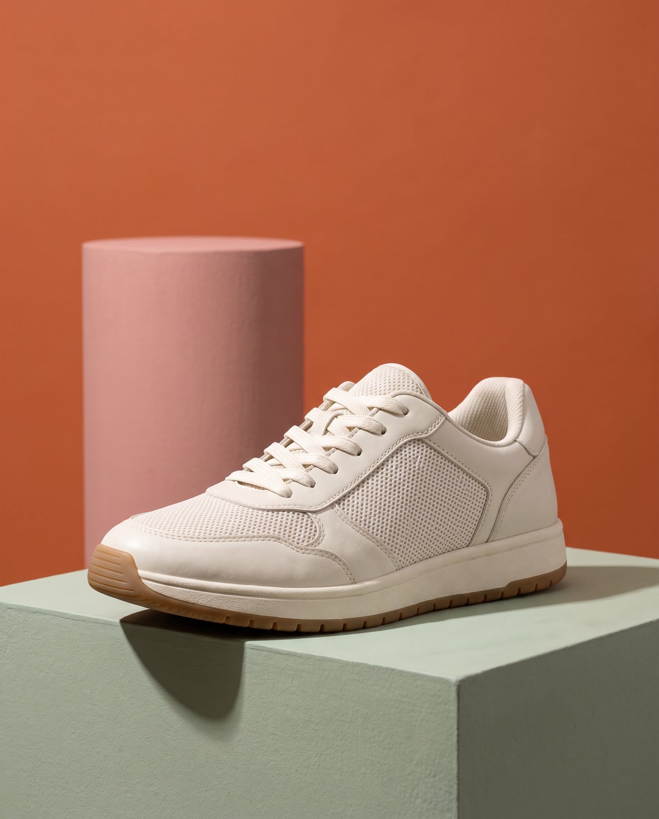
A simple set with one light direction: the shadow under the trainer and the one behind the prop fall the same way, and the prop stays behind the product.
Where AI backgrounds go wrong
We ran our own test, so these are real failures rather than theory. In a demo run on 2 October 2026 we shot 10 products (a perfume bottle, skincare jar, trainer, handbag, mug, steel bottle, coffee pouch, headphones, chair and necklace) across 3 scenes each. That's 30 shots. Of those, 27 were delivered and 3 were held back by the check.
The easy ones first. The trainer, the chair and most of the mug, headphones and necklace scenes passed on the first attempt. Solid shapes with simple finishes tend to behave.
The hard ones were colour and metal. A coral skincare jar and an amber perfume bottle both drifted in colour, and one perfume attempt was rejected as "colour wrong". Colours like these are easy to nudge. The coral jar on wet poolside stone never passed the check, and was one of the 3 held back.
Brushed steel was worse. It picks up its surroundings, so the "same" bottle looks different in every room. Two steel bottle scenes, a mountain campsite and a fitness studio, failed all three attempts and were never delivered. The one steel scene that did pass was a plain, sunlit desk.
Text is the other weak spot. In a separate test on 1 October 2026 with a famous-brand trainer, small printed text on the product (a tongue label) came out garbled on most shots. Logos and large text held up. So if your product carries fine print, assume it's at risk and look closely.
That same test showed something sellers of branded goods should know. Image services refused 5 of 14 generations with the famous-brand trainer, while an unbranded product had none refused. If you sell someone else's famous brand, expect friction.
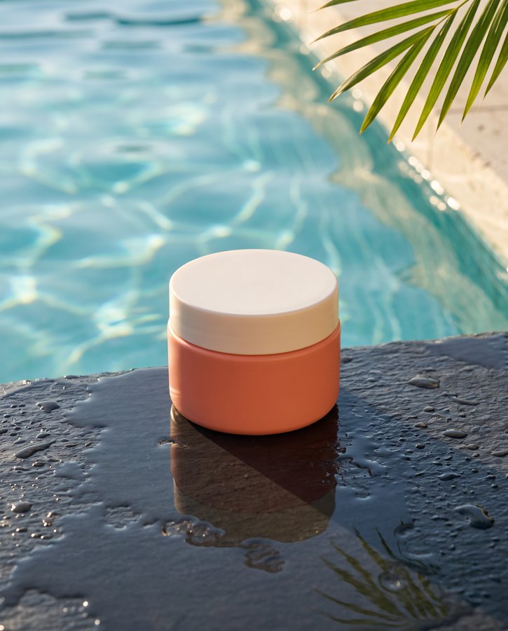
Bright sun on a wet, reflective surface: the check found the coral jar's colour shifted on every attempt in this scene, so it was held back after three.
Check every image before you use it
Treat the AI result as a draft and the original photo as the truth. Put them side by side and go through this list:
- Colour. Compare the product's colour against the original, on the same screen, at the same brightness. Drift is subtle and easy to talk yourself out of.
- Every word. Read all text on the product, letter by letter. Garbled or invented text is a classic quiet failure.
- Shape. Outline, proportions, handle curves, the slightly wonky handmade bits.
- Finish. Matte should stay matte; gloss should stay gloss.
- Small details: stitching, buckles, seams, engraving, buttons.
- Nothing added. A logo, a pattern, an extra strap.
- Nothing missing. A clasp, a tag, a vent hole.
If the product has changed, reject the image. Don't retouch it into shape. Retouching a redrawn product means you're now editing something that was never your product, and you'll miss things. Run it again instead.
And keep a real photo in every listing. A shopper should always be able to see the actual item, unstyled. AI scenes work best as extra images, not as the only evidence of what you're selling. This applies even more if the AI version flatters. For a fuller view of what the technology gets right and wrong, see what AI product photography gets right and wrong.
How Product Photo Shots helps (and what it doesn't do)
Product Photo Shots does the two jobs this guide asks of you: it writes the scene and it runs the check.
Before you pay, we study your photo and list what must stay the same. That's free and takes about a minute (the precheck measured 11 seconds on 1 October 2026). If a shot changes the product, it's remade with a specific fix, up to three attempts in all. If it's still wrong, a person checks it, and it is never delivered as is. In an adversarial test, the check rejected a product recoloured blue ("colour wrong") and a product with a made-up logo added ("added text").
Each delivered shot comes with one free redo. Shots come in square 1:1, portrait 4:5, story 9:16 and wide 16:9. Every shot is reimagined with AI and labelled, and files carry standard AI-provenance metadata. A 3-shot order took about 4 minutes in testing on 1 October 2026.
Pricing, with VAT included: 3 shots for £19 (£6.33 a shot), 5 shots for £29 (£5.80), 10 shots for £49 (£4.90), and a custom 11 to 40 shots at £4.50 a shot.
What we don't do. We don't make plain white-background packshots. We can't shoot products from well-known brands, because image services refuse them, and customers are told before paying. And we can't guarantee every scene on every material; brushed steel is the honest example, as the two undelivered bottle scenes show. It's for products you own or sell, and the check is there because the tool isn't perfect.