The short answer
Pick two or three ideas that answer what a buyer is quietly wondering. Where would I use this? How big is it? What does it feel like in the hand? A set of photos that answers those three questions is more useful than a prettier set that doesn't.
So skip the scroll through whatever style is fashionable this month. Look at your product, work out what a stranger can't tell from a plain white-background shot, and photograph that. One in-context scene, one close-up, one shot that shows size. Done. Everything below is a menu of ways to do each of those, plus a few extras for when you want more.
In-use and in-context scenes
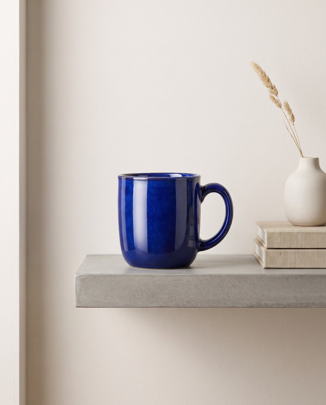
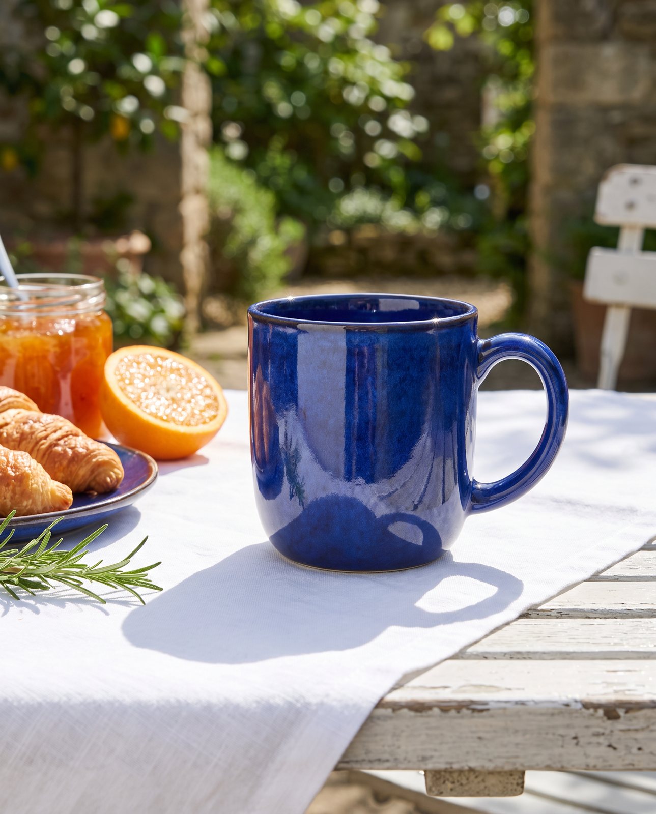
Put the product where it belongs. A mug on a kitchen counter with a bit of morning clutter behind it. A bag on a café table next to a coffee cup. A candle on a bedside shelf with a book. The buyer is trying on the life that comes with the object.
This is the idea that answers "where would I use it?", and it's the one most small sellers skip because it feels like more effort than a plain shot. It is more effort. It's also the one that makes a product feel real rather than catalogued.
Keep the scene honest, though. The product should be the clearest, sharpest thing in the frame. If your eye lands on the nice plant first, the plant is the hero and you've shot the wrong picture. Blur the background a little, keep props small, and let the product sit where the light is best.
A few starting points:
- Food and drink on a table, mid-meal, with one hand's worth of mess nearby.
- Something you wear or carry, placed on a chair, hook or doorknob as if just put down.
- Something for the home, shot in the room it would live in, at the angle you'd actually see it.
If you want the longer version of this, with set-ups and lighting for sellers who shoot their own, the lifestyle photos guide goes through it step by step.
Flat lays and overhead shots
Flat lays suit flat, small or grouped things. Stationery, accessories, kits, sets, anything that looks better arranged than stood up. Shoot from directly above and you get a tidy, graphic image that works well as a thumbnail because the shapes read at a glance.
Two arrangements cover most needs. A grid, where items sit in neat rows with even gaps, says "organised, complete, all here". A loose pile, where things overlap and spill a little, says "relaxed, handmade, lived in". Pick the one that matches your brand and stick with it across the listing.
Shadows are where flat lays go wrong. If one item throws a shadow to the left and the next throws it to the right, the whole thing looks pasted together. Use one light source, keep it to one side, and check that every shadow falls the same way before you press the shutter. A window with a sheet of white paper opposite to bounce light back is plenty.
Keep the camera square to the surface. A slight tilt makes the edges of the frame lean, and rectangular products will look wonky even when they're straight. Take a few frames, then compare them side by side. The straight one is usually obvious.
One practical point: a flat lay needs every item physically in front of you. You're arranging real objects, so build the set from the products you actually have.
Texture and detail close-ups
Texture is the thing a buyer can't get from a screen, so give them as much of it as you can. A macro-style close-up of stitching, grain, weave, glaze, grind or finish tells them about quality without a single word of copy.
Get close, then get closer. Fill the frame with the material. Leather with its pores showing, a ceramic edge where glaze pools, the teeth of a zip. Even the knit of a jumper. Light it from the side, low and raking, because side light throws tiny shadows across the surface and makes texture look three-dimensional. Flat, front-on light does the opposite and smooths it all away.
Focus is fussy at this range. A small slip and the part you wanted sharp goes soft. Use a steady surface or a support, and shoot a few frames at slightly different focus points. Pick the one where the detail you're proud of is crisp.
Don't overdo it. One or two close-ups per product is enough. They're there to answer "what does it feel like?", and once that's answered, more of the same just pushes the useful pictures further down the page.
Scale, hands and people
Buyers can misjudge size from a photo. The cheapest fix is to put something familiar beside the product. A hand holding it. A coin, a pen, a mug, a phone, a house key. Anything the viewer already has a feel for.
A hand shot is the simplest. Hold the item naturally, as you would use it, not presented like a prize. Keep nails tidy and sleeves plain so nothing competes. Shoot against a calm background and let the product take the attention.
Photographing people is a step further, and it comes with a rule: get consent. If anyone other than you appears in a picture, even just their hands or back, ask first, and be clear about where the image will be used. Don't assume a friend or family member is fine with it showing up on a public listing.
Be careful what the picture implies, too. Showing a person with your product is fine. Suggesting that it does something for them, that it changes how they look or feel, is a claim, and the photo shouldn't make promises your description wouldn't. Stick to showing size and use.
Seasonal and gifting looks
Plan seasonal scenes some weeks before the sales peak, not during it. By the time a buyer is searching, you want the listing already dressed for the occasion. Shooting in a panic the week before leaves you with whatever light and props happen to be around.
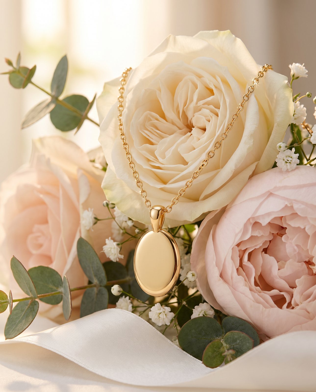
Think in layers. Gift wrap, ribbon, a tag, a small sprig of something seasonal, a tray of wrapped parcels. Seasonal colours do a lot of the work by themselves: warm reds and deep greens for winter, soft pastels for spring, bright and sunny tones for summer. You don't need a full set. A ribbon and a bit of tissue paper can turn an everyday product into a gift in one frame.
Work backwards from the date you want to be selling. Add the time to shoot, edit and upload, then add a margin for things going wrong, because they do. Set yourself a sell-by date for the seasonal pictures too. Once the occasion has passed, swap them out. A Christmas scene sitting on a listing in spring looks neglected.
Keep a note of what you shot and when, so next year you can reuse the plan instead of starting from scratch. A short list is plenty.
Colour, props and mood
Give each set one colour story. Choose a small palette, two or three tones that sit well with your product, and keep everything else in that range. A set where every picture shares a palette looks like a brand. A set where each picture has its own colours looks like a collection of leftovers.
Props should suit the product, not decorate it. A wooden spoon beside a jar of honey makes sense. A random cactus doesn't. Ask of each prop: would this plausibly sit next to the product in real life? If the answer is no, take it out. Fewer props usually look better than more.
Then there's mood, which mostly comes down to light and background:
- Bright and airy: pale surfaces, soft daylight, lots of white space. Clean and fresh, good for skincare, linen, stationery.
- Dark and moody: deep backgrounds, one directional light, strong shadows. Rich and a little dramatic, good for candles, spirits, jewellery.
- Warm and rustic: wood, natural fibres, golden light. Cosy and handmade, good for food, ceramics, home goods.
Pick one mood per set and hold to it. Switching between airy and moody halfway down a listing feels like two different shops.
Choosing ideas that fit your product
Not every idea suits every product. Here's a rough guide by type, two ideas each.
For food and drink, try a table scene mid-meal, and a close-up of texture such as crumb, gloss or steam. Both make people hungry, which is the point.
For beauty, try a clean, bright shot on a bathroom shelf or vanity, and a flat lay of the product beside its ingredients or tools. Soft light flatters most packaging.
For jewellery, try a close-up on a neutral surface to show the finish, and a hand or neck shot for scale. Dark and moody backgrounds make stones and metal stand out.
For bags and clothing, try the item in use, on a chair or hung on a hook, and a detail shot of stitching, fabric or hardware. Add a flat lay if it's folded or part of a set.
For home and furniture, try the piece in a styled room, and a close-up of material and joins. A familiar object beside it helps with size.
For electronics, try it in use on a desk with the usual surroundings, and a clean overhead of the product with its cables and accessories laid out.
Now the honest bit. Some things are just harder to photograph well. Shiny metal is the toughest, because brushed steel and polished surfaces pick up everything around them, and the reflections end up looking messy or wrong. Small printed text is the other awkward one, since fine lettering blurs, warps or goes unreadable very easily. Whichever way you shoot, give these products more time, more test frames and a plainer setting, and check the result closely before you publish.
How Product Photo Shots helps (and what it doesn't do)
Many of the ideas above are scenes we can make from one photo of your product: in-use scenes, mood looks, seasonal settings. You upload the photo, and we put the product into a new scene. If you want the detail, see how to put the product in a new scene.
Before you pay, we study the photo and list what must stay the same. That check is free and takes about a minute. If a shot changes the product, we remake it with a specific fix, up to three attempts in all. If it's still wrong, a person checks it, and it is never delivered as is. You also get one free redo per delivered shot. Shots come in square 1:1, portrait 4:5, story 9:16 and wide 16:9. Every shot is reimagined with AI and labelled, and the files carry standard AI-provenance metadata.
Pricing is simple. Three shots cost £19 (£6.33 a shot), five cost £29 (£5.80), and ten cost £49 (£4.90). Custom packs of 11 to 40 shots are £4.50 a shot. Prices include VAT.
Here's what it won't do. We don't make flat lays of several products you haven't photographed, we don't make people shots, and we don't make 360 spins. And it has real limits on tricky materials. In our own tests, colour drifted on a coral skincare jar and on amber perfume, and one perfume attempt was rejected as "colour wrong". Brushed steel picked up its surroundings: two steel bottle scenes failed all three attempts and were never delivered. Small printed text, such as a tongue label on a famous-brand test, came out garbled on most shots, though logos and large text held. That's why the free check matters.